My role: UI Design, Prototyping, Research and Analysis.
Design Tools: Figma, Miro & Trello
Client: GLobhe Drones AB
Timeline: 8 Weeks (2022)
Globge Drones AB is where I did my first Internship (LIA) as a UX Designer. This was a project that I and fellow UX designer Netsanet Assaye were working on, we worked close with the Dev team, sales department and other parts of Globhe Drones AB.
Challenges:
A Complete redesign of the Platform, Crowddroning by GLOBHE.
Identifying users pain points.
Improving the experience of the users.
Enhancing functions of the platform, while introducing or removing some if deemed necessary.
Starting a solid ground work for future gamification.
Non-disclosure Agreement:In order to respect the NDA, I will not be able share any detailed visuals and information related to work, other than what's publicly accessible.
Research & Analysis
Surveys: We sent emails to a huge number of registered drone pilots on Globhe, asking them to take a survey, it was a Goolge Forms survey, where we asked them about what liked and what could be improved on the platform, or if any new functions would improve or make their life easier on the platform. Survey included: Multiple choice questions, rated answers, yes or no, and of course text inputs for their direct and unfiltered thoughts.
Privacy: It was as privacy oriented as Google Forms allowed, for example neither personal information was asked nor were they forced to log in.
Interviews:
This was another activity we did for research purposes on multiple occasions, the main reason was to get direct input of the Pilots and test some prototypes. While testing directly with the pilots we provided them with different scenarios, in order to be able to test different functions and flow of the platform.
User Journey: We already made a user journey map, but after analysis of the surveys and interviews, we improved upon out user journey map, which of course gave us far better understanding of pilots Pain-points.
Sneak Peek of the Design
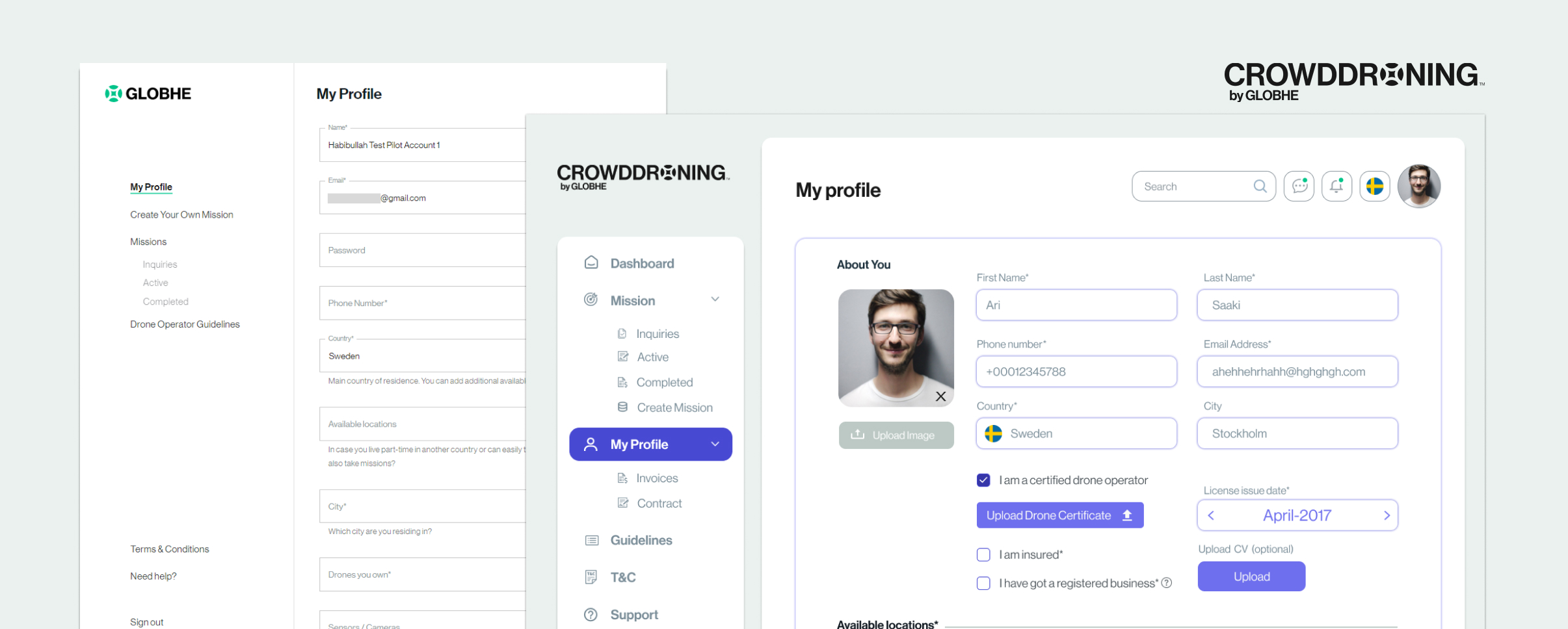
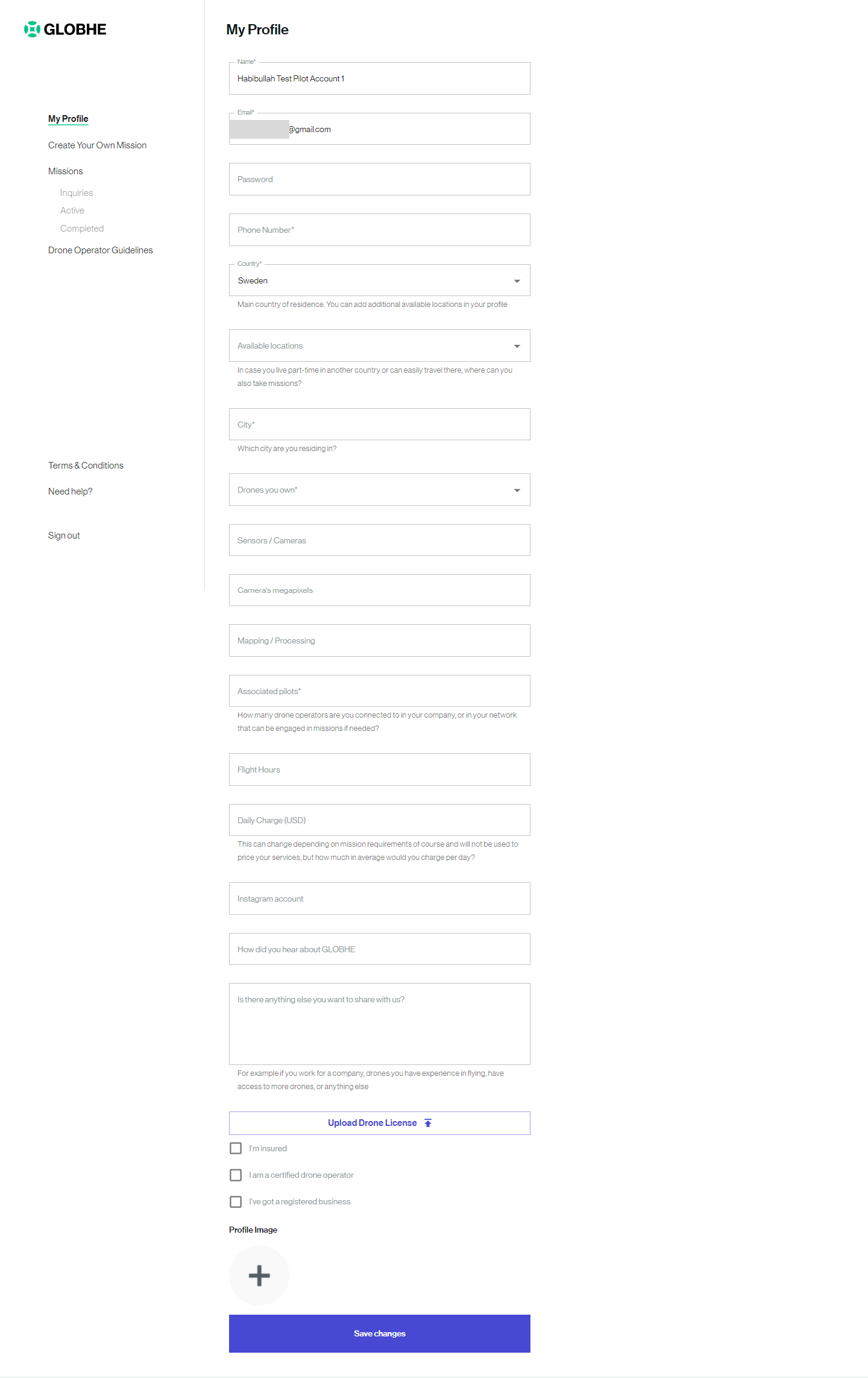
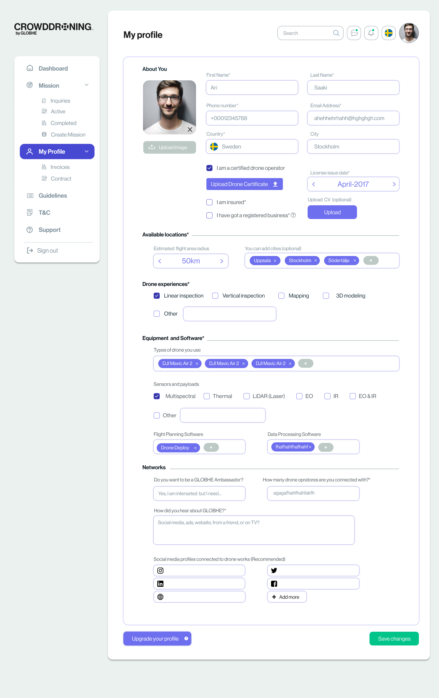
Here is a sneak peak of Profile page of drone pilots, on the left you see the previous design and improved version on the right. The page was accepted and was pushed for coding. Though an improvement to the previous design, we still were experimenting with tabbed and separate sections for each parts of the profile, as to not overwhelm the users with too much input requirements.
Most of the design has been implemented, and is live now. Head over to Globhe and check it out.