Lexplore - How to Encourage Kids to Read More?
Team: Shirine Haidary, Alice Englund, Daniel Windfeldt, Habee Shirzad
My role: Visuals, Research, and Analysis.
Design Tools: Figma, Mural, Miro, Figjam, Google Forms.
Timeline: 4 Weeks (13 sept 2021 – 22 Oct 2021)
Clients: Lexplore & Nackademin
Overview:
In this project the goal was to do an intensive research to find answers to;
“Hur kan vi bättre motivera elever att själv utvecklas i sin förmåga att läsa, med hjälp av teknik och design?”
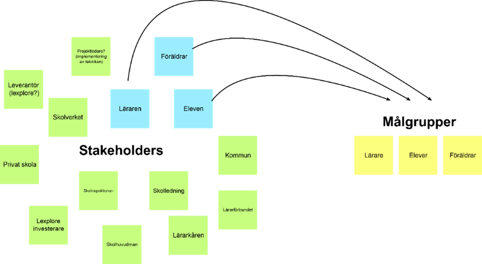
The following is the process and steps we had taken to achieve our goal within the time limit of the project, please note that the following might not be in chronological order, that is because some parts of the research had to be revisited again, in order to make changes and redo some steps.
Double Diamond Design Process
We followed the Double Diamond Design Process, although it might seem to be a bit of a linear process, but it isn’t, we often found ourselves taking one or two steps back in order to produce a better result, rather than rushing for a quick and acceptable result.
Qualitative and Quantitative Research:
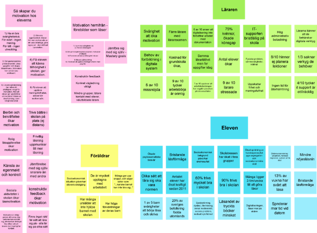
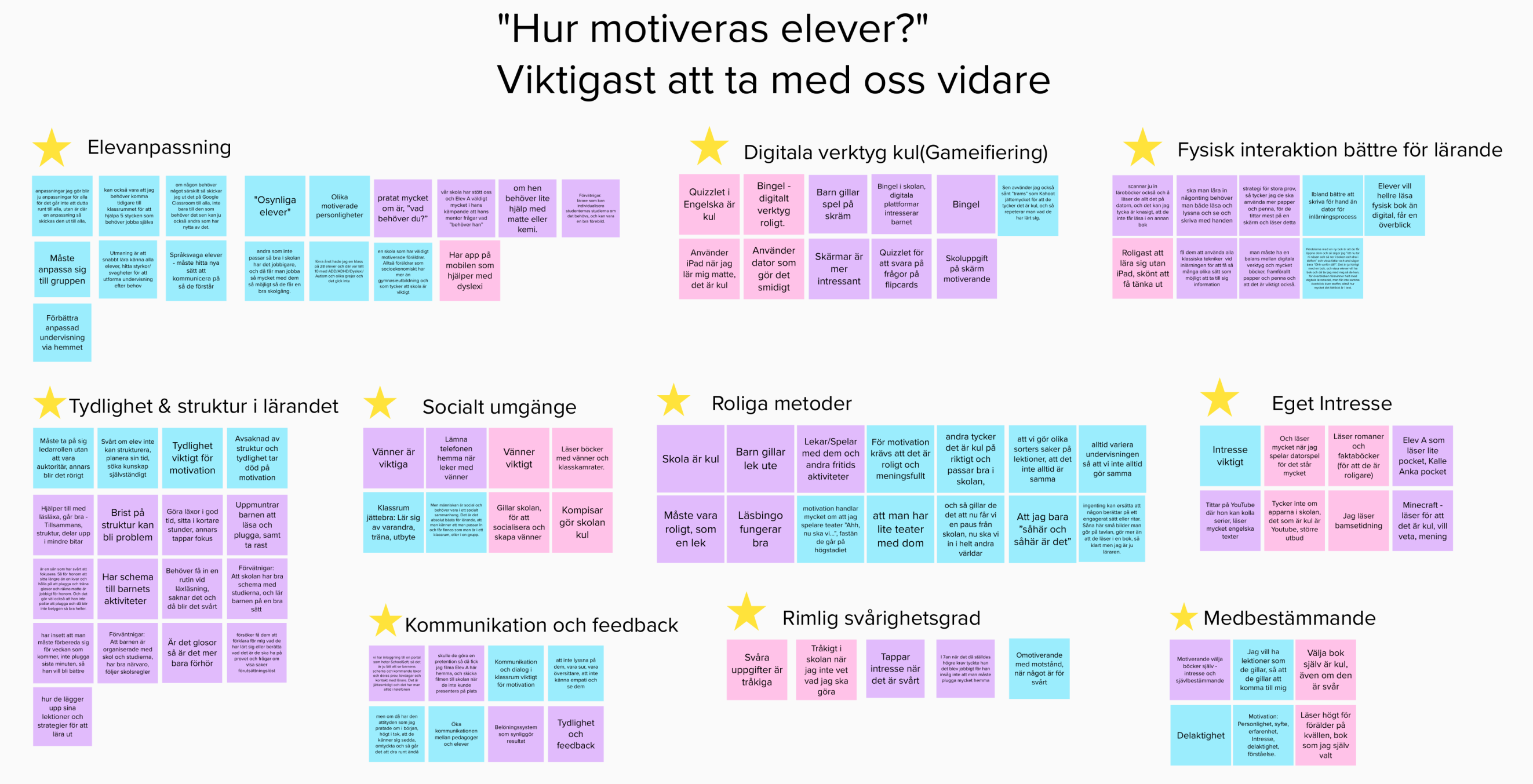
We interviewed a total of 6 students, 4 parents and 3 teachers, in addition to interviews we also did some online surveys for the students.
Personas:
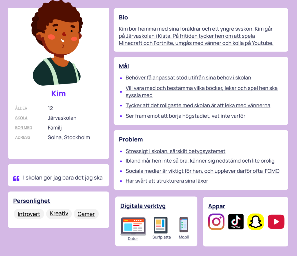
Based on our findings from researches and interviews we created two personas, Student and Teacher.

User Journeys:
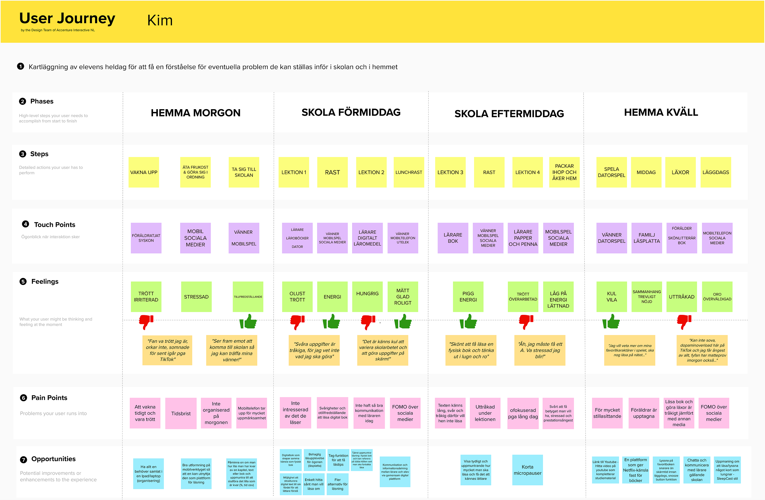
Creating personas gave us broader understanding of our target groups, therefore we could pinpoint their goals and problems, that combined with new information received through an online survey, we were able to create two user journeys, one for Kim the student and another for Karin the teacher.
Thoughts and Takeaways
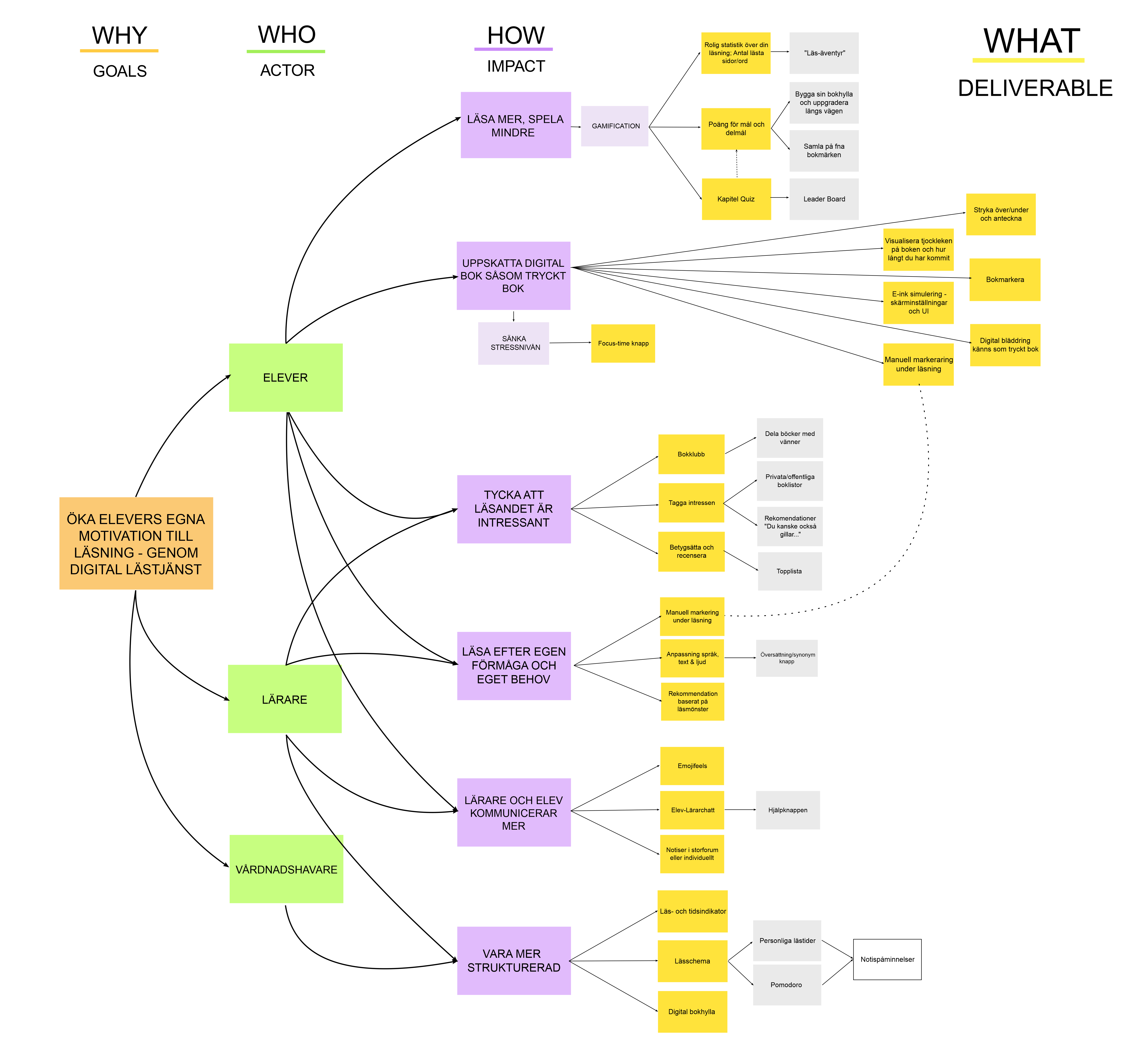
This project was very research and analysis heavy, though the purpose was not to create a final solution in a hi-fi prototype form, but a solution, in the given time limit that is. When we closed in to the deadline we reach our “Impact Map”, which maps some of the creative solution we came up with. Therefore instead of rushing into creating a half-baked wireframe or a prototype, we instead focused on the Impact Map instead, and filtered out even more.
One of the lessons learned is that the design process is rarely linear. Although the phases have a logical time sequence, they overlap each other, and throughout the process you constantly iterate back and forth between them to move forward.
