My role: UI/Visual Design, Prototyping and Research
Design Tools: Figma, pen and paper.
Timeline: 2 Weeks, December 2022.
Table of Contents
Summary
The project involved redesigning a webpage for a gaming podcast, with a basic and confusing design, using Figma as part of a UI Design class project. The first step was to identify areas that needed revamping or improvement, followed by choosing a Neon dark theme design that relates to gaming.
The redesign involved simplifying the layout, adding visual interest with dynamic typography and graphics, and enhancing the user experience with improved navigation and accessibility. The project culminated in a fully realized redesign that demonstrated the designer’s proficiency in UI design principles and Figma tools.
Identifying the Problems
To identify the problems with the current design and layout of the webpage, I conducted a thorough analysis of the website’s usability and user experience. Through this analysis, I was able to pinpoint several areas where the website fell short, including the confusing navigation structure and lack of clear visual hierarchy. By identifying these issues, I was able to develop a clear plan for addressing them and improving the overall user experience of the website.
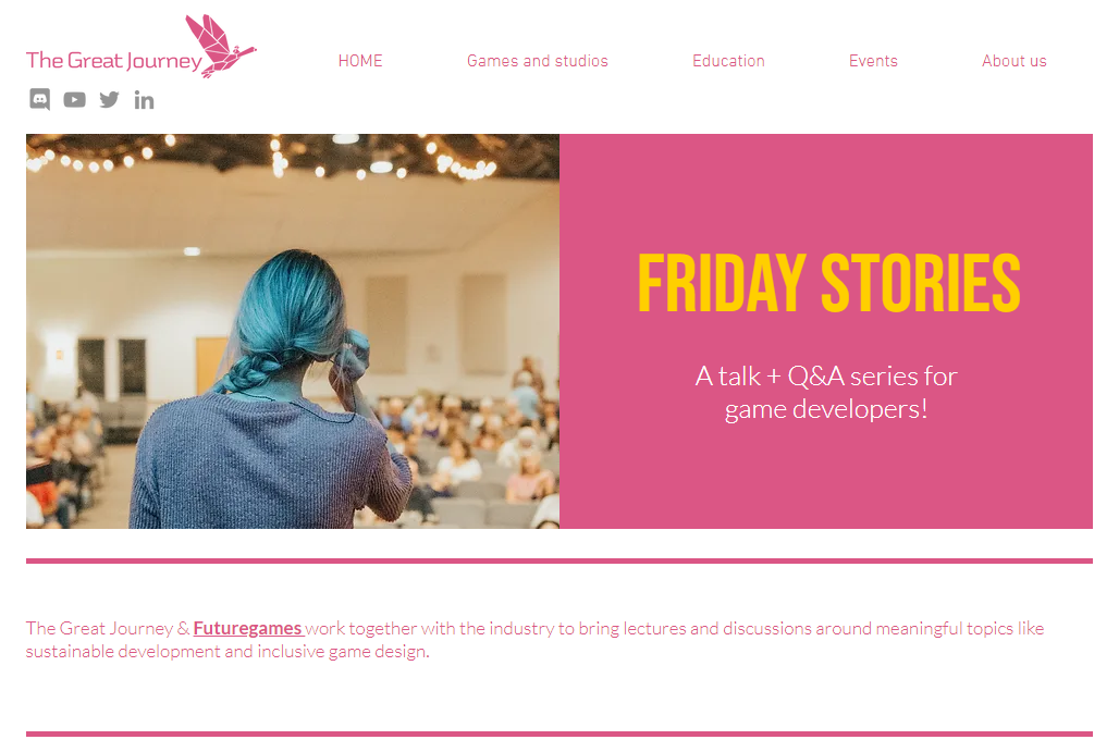
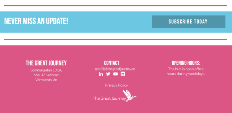
The Header & Hero Section
The header section currently has too much information, making it cluttered and overwhelming for the user. To improve it, we could separate it from the hero section using visual cues such as color or white space. Additionally, the icons used in the header seem out of place and don’t contribute to the overall design. By simplifying the header and removing unnecessary elements, we can create a cleaner and more effective design.
The hero section could benefit from some improvements. The image may not be the most effective in conveying the message or purpose of the webpage. Additionally, the contrast between the pink and bright yellow could be increased to improve legibility, and the contact between the white background and the pink could also be improved.
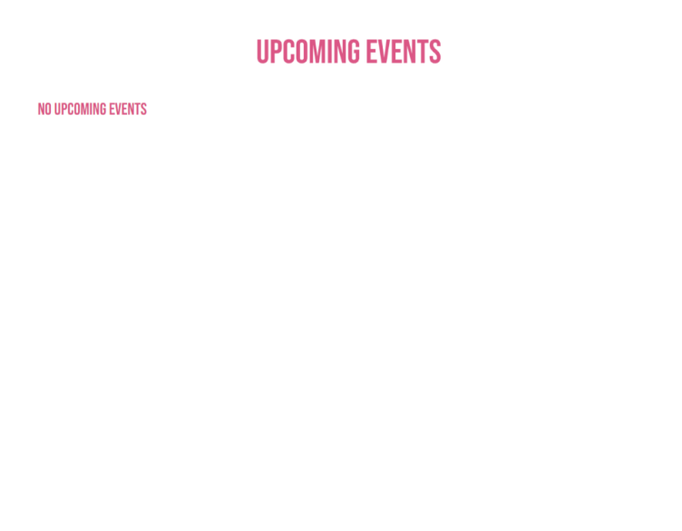
Upcoming Events
The Upcoming Events section appears empty with only the text “No upcoming events.” It takes up a significant amount of space on the page without providing any valuable information to the user. It would be beneficial to reduce the section’s size and include additional content such as a list of previous events to provide more context for the user.
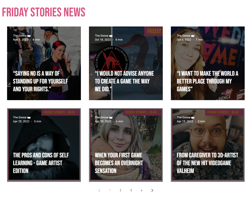
Friday Stories News
Misleading impression that they are audio news when they are actually blog posts
Thumbnails are cluttered
Titles do not need to be placed on the thumbnails
Simplifying the thumbnails would be better
Reduce the number of cards displayed since pagination is available
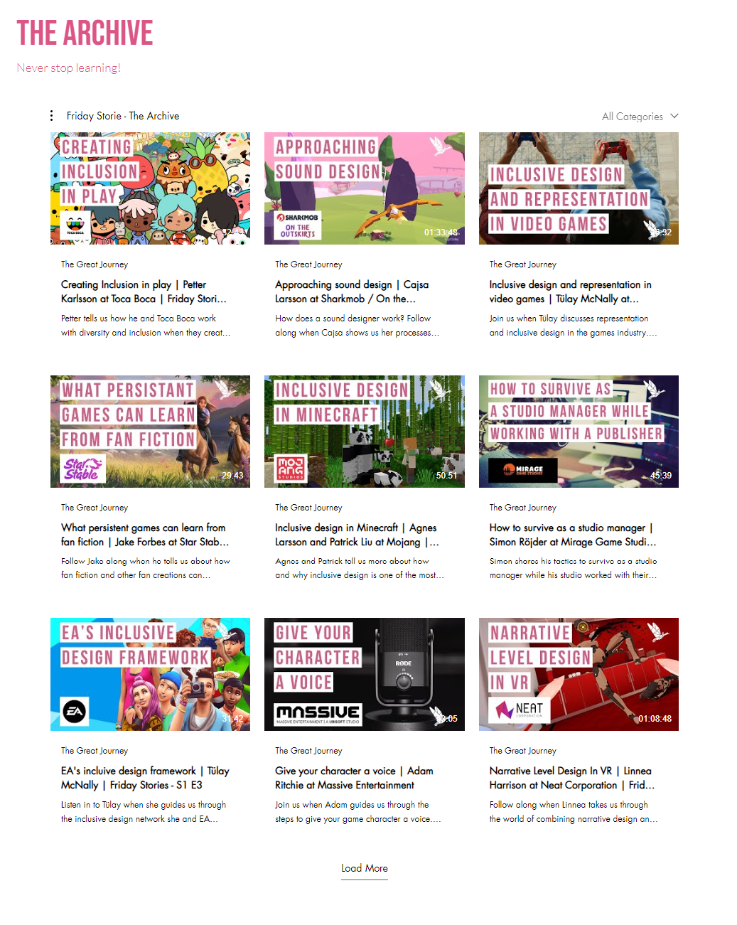
The Archive
This section requires a lot of improvements, as there is too much information displayed on the page. Here are some specific areas that need attention:
Too many cards are displayed, which can be overwhelming for the user.
Names of the videos are too long and not fully visible until you hover over them, which can be frustrating for the user.
The excerpt is unnecessary in this case and adds to the clutter.
The length of the video is not very clear and visible, which can be confusing for the user.
Thumbnails have too much going on and should be simplified. Since the title is displayed below the thumbnail, it should be removed from the thumbnail itself.
The overall design could be improved by having larger cards, clearer thumbnails, and less clutter.
Subscribe - CTA
The current CTA (Call to Action) is visually unappealing and lacks creativity.
A more eye-catching color scheme could be used to make it stand out.
Adding an input text field for email would make it more convenient for users to subscribe.
Including some brief information about what subscribers can expect to receive would be helpful in encouraging sign-ups.
The Footer
The footer section could use some improvements to its organization and copy to enhance user experience. Here are some potential changes:
Clearer and more prominent display of opening hours and office address
Improved placement of social media icons for better visibility and accessibility
Simplified layout to reduce clutter and improve readability
Consistent color scheme and typography to match the overall design aesthetic
Theme & colors
In considering the color scheme for the website, I initially thought of a dark theme with bright accents, which is often associated with gaming. However, I ultimately decided to go with a Neon theme that would still incorporate the website’s current colors. I realized that the current colors wouldn’t work well for the neon style, so I created different shades and hues of pink, blue, and yellow to achieve the desired effect.
Brainstorming and Wireframing
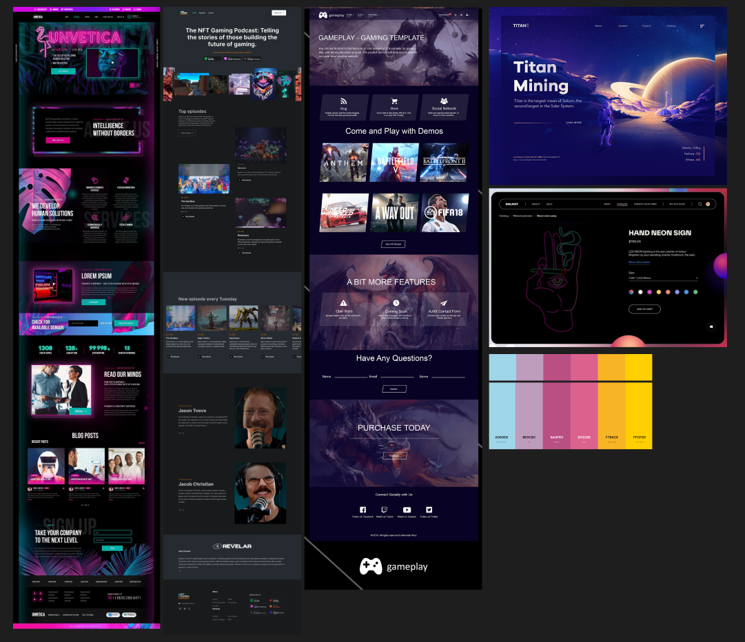
I started with some Googling for inspirations for the layout of the page. Looking for Gaming and podcast websites with Neon themed designs.
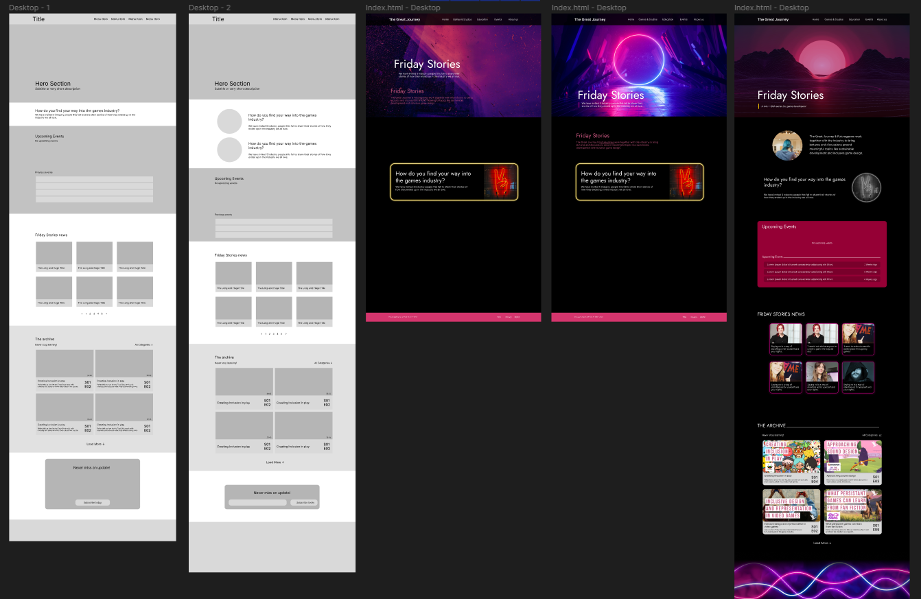
Then continued with a redesign of the wireframe with few iterations, and started playing around the design of the page itself, applying different colors, images, backgrounds and shapes, just to get the feel of it.
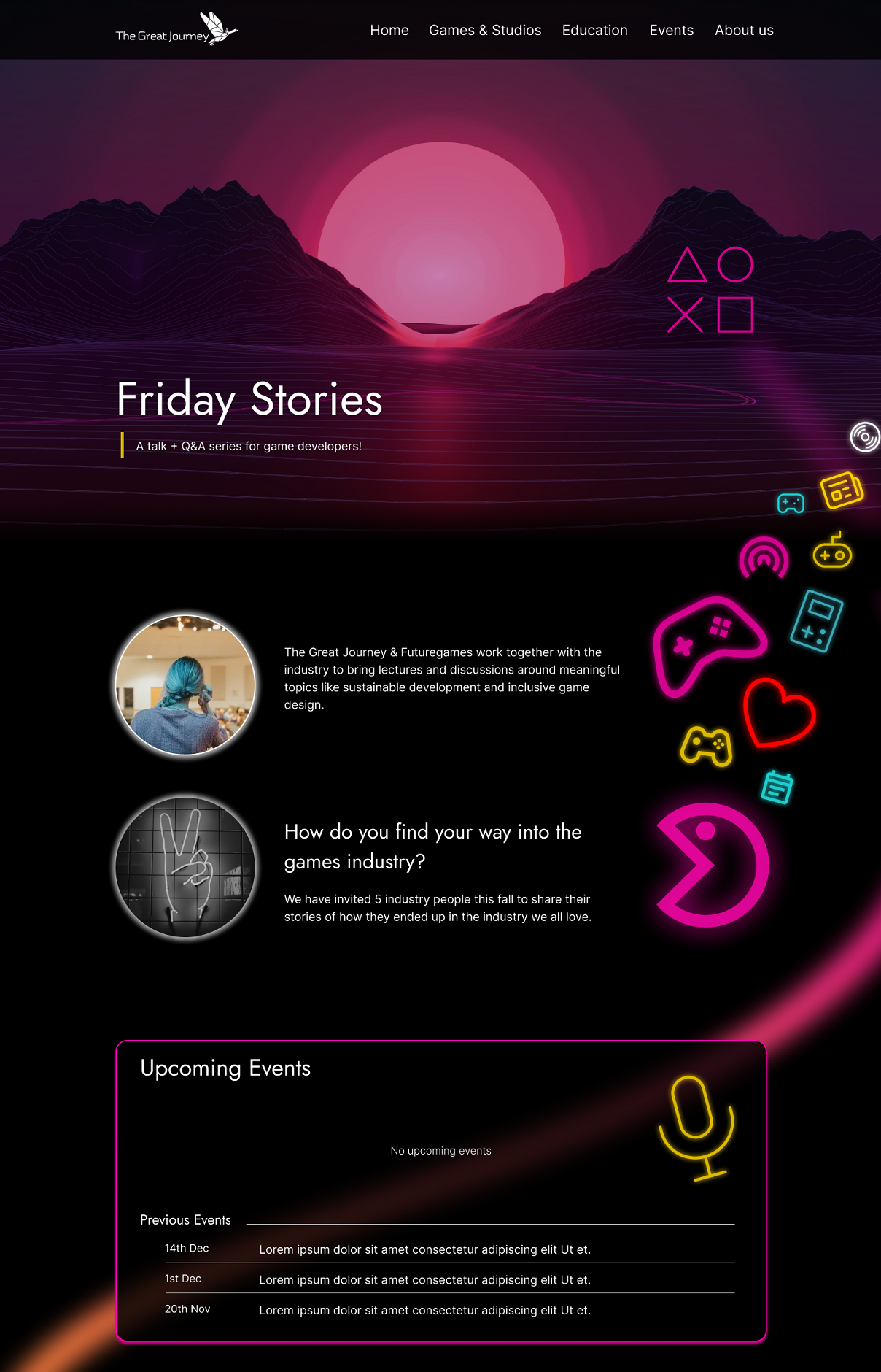
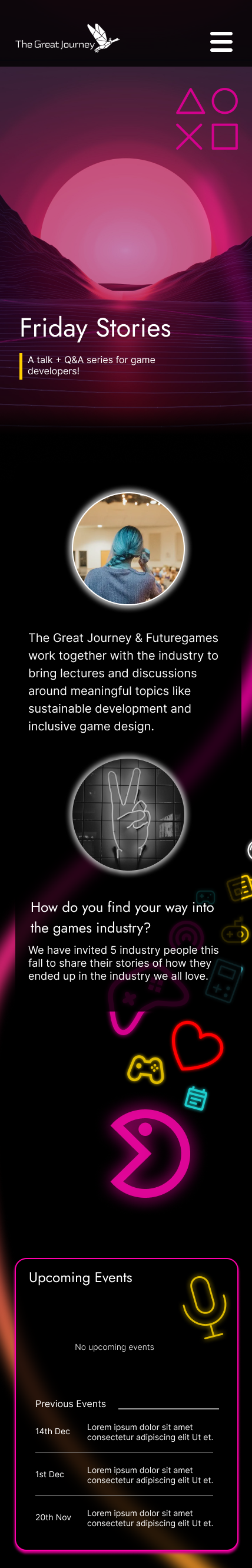
Final Prototype
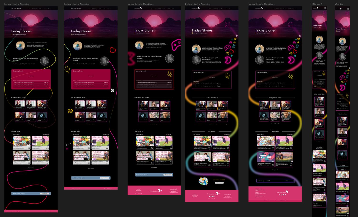
Naturally with the next step I started designing the prototype, of course building upon the wireframe and drafts. Improving upon each iteration of the design. As you can see I also worked on the mobile version of the page as well.
After many iterations of the design, I was finally satisfied with the design, when it checked all the design requirements and improvements that I had planned for. Here is a sneak peek of the final final design.