Bibliomania - Prototyping Project

Designer: Habee Shirzad

My role: UI Design, Prototyping, Interviews, and Analysis. 

Design Tools: Figma, Figjam, good old pen and paper!

Client: Myself & Nackademin (Prototyping course)

Timeline: 4 weeks

Overview:

The goal of this UX project was to help new customers decide how much material they need to finish their small projects at home.

Challenges: 

  1. A web-based “Raw Material Calculator” that doesn’t require maintenance, except the initial release, and isn’t connected to products or products page directly.
  2. Find a solution to “Why new DIYers give up early in their journey?”

To cut to the chase, this is an individual class project, part of the Prototyping course. The project was a “whatever you want to design” kind, and I used this opportunity to design this app, and named it Bibliomania. 

Background

Reading is one of my favorite hobbies. I am into horror, science fiction, crime, mystery and any combination of these genres. I listen to audio books more often than reading. Although I am not an avid reader I would like to keep track of what I read or listen to- especially since I use many sources and different platforms, such as Audible, BookBeat, Google Books and more. This creates a need for a platform where I can keep track of all the books. As you might’ve guessed by now, I mainly use Good Reads, on both my PC and smartphone. 

At the time of starting this project I was not very fond of its User Interface (UI), and it always felt bloated to me. I wanted to use this opportunity and do my take of a similar app, without the functions that I think bloats the platform. And of course all in a Dark themed UI.

Main Goals

Reader Centered

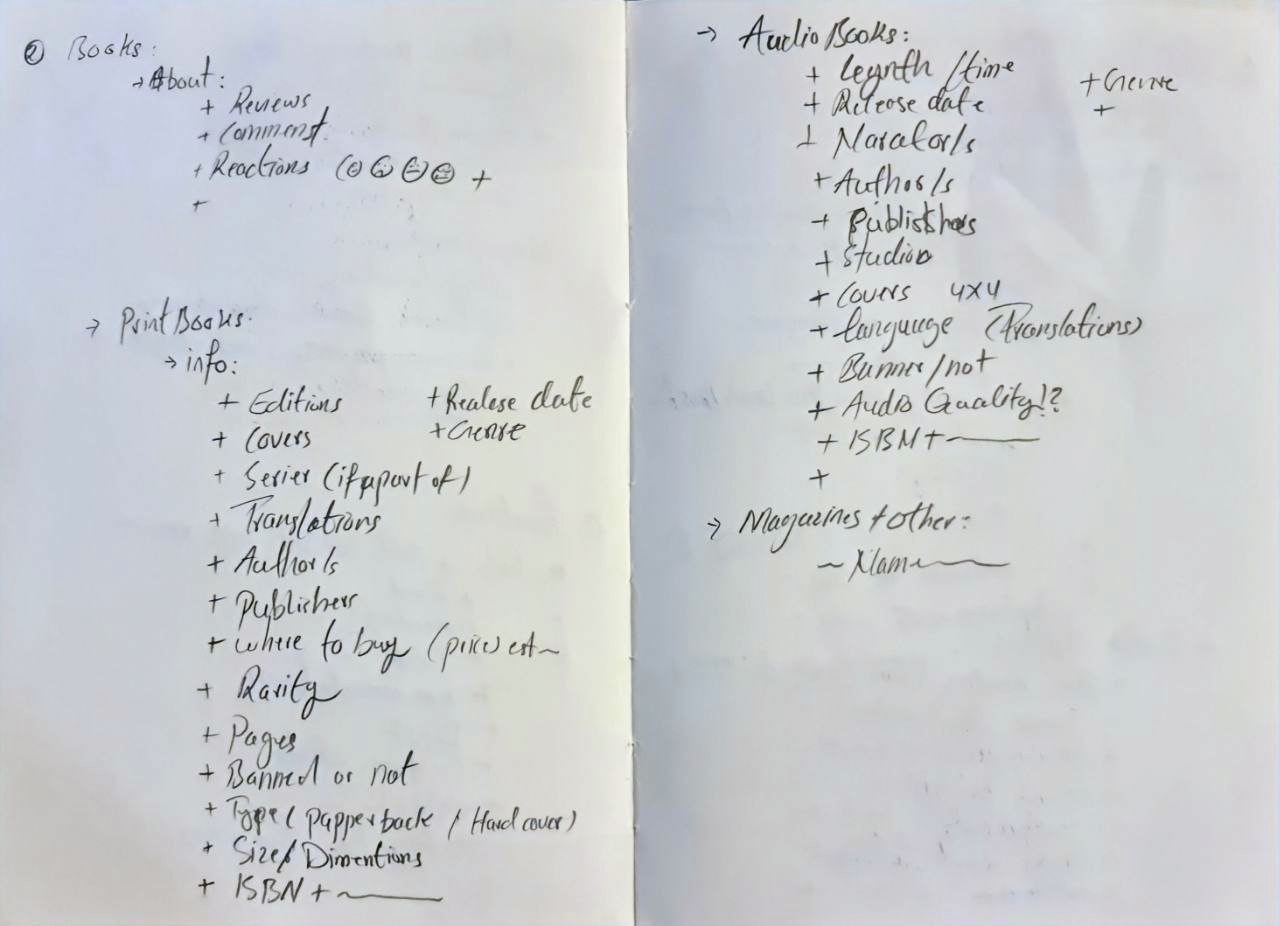
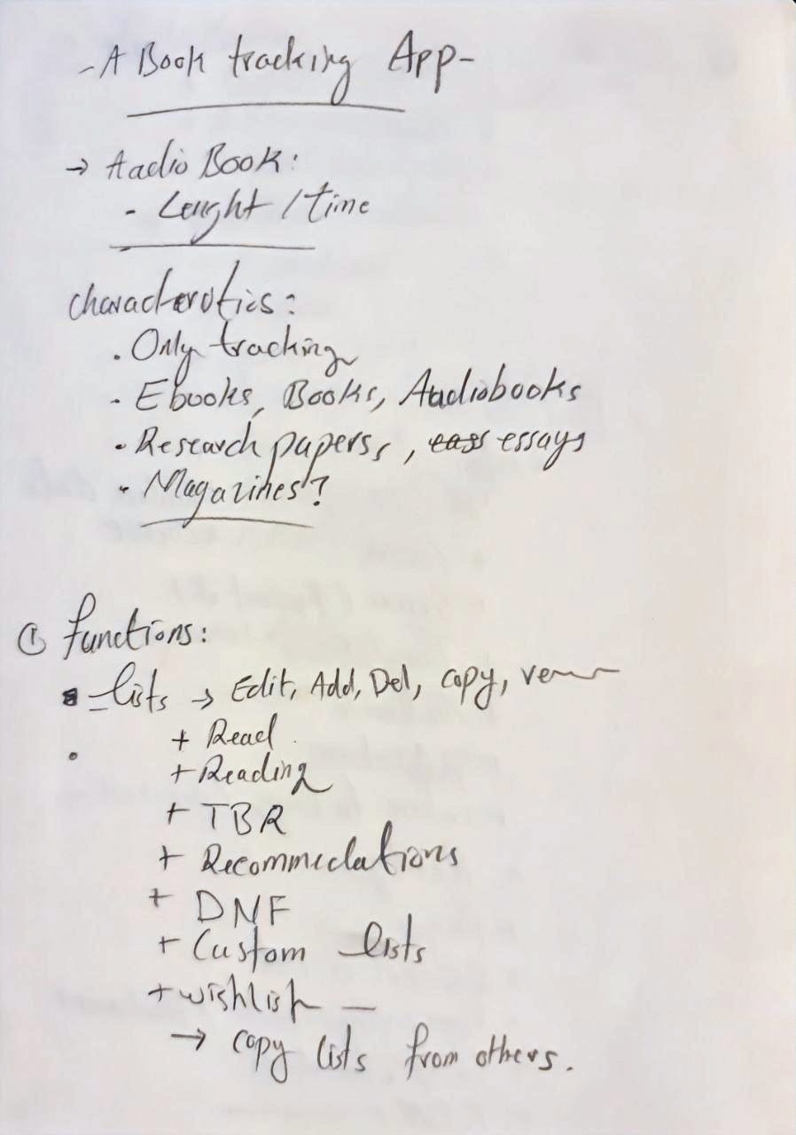
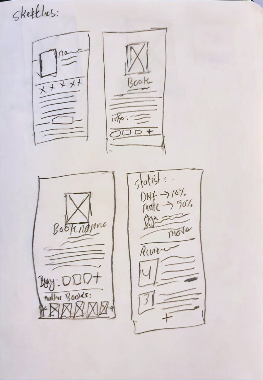
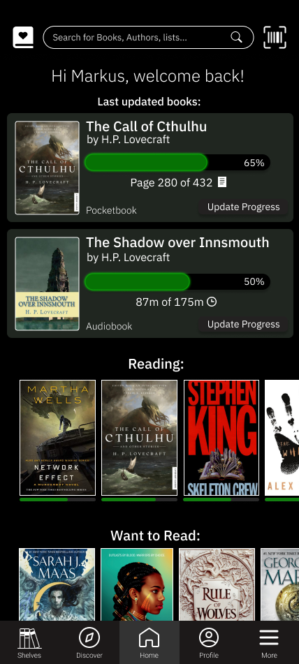
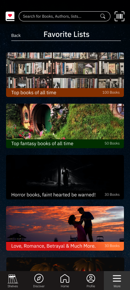
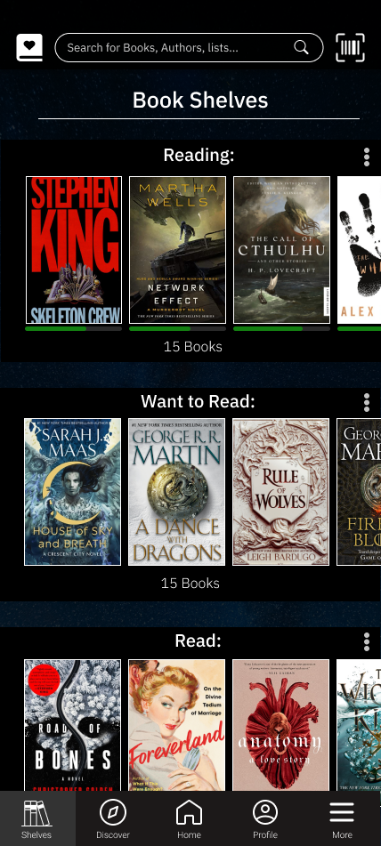
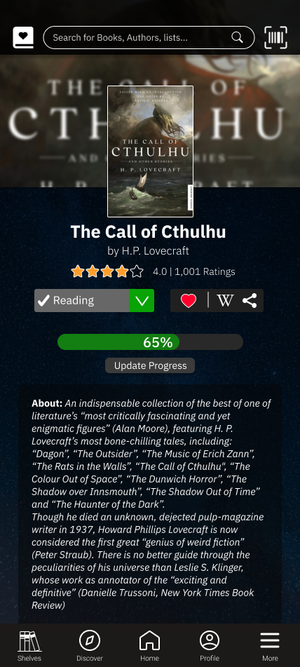
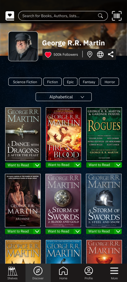
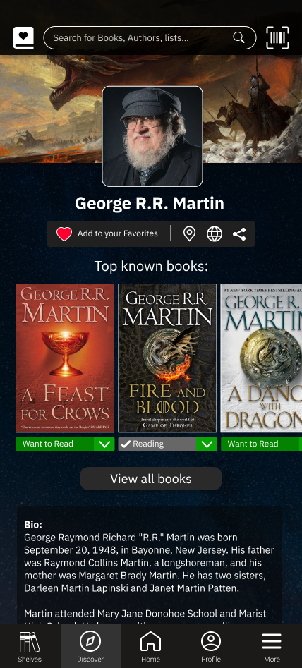
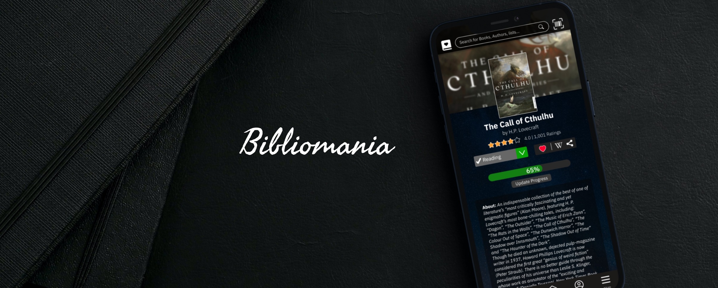
The main focus of the app will be the readers, and books. Easily track and Review Books.

UI Improvements

New and a modern UI design, with none/less non-related distractions.

Debloat​

Exclude as much social media related functions as possible, such groups, author blogs, intrusive ads and Etc.

Iterative Design

Since I had Good Reads App as a point of reference, and this project not an overhaul of the platform, I could skip some of the design process, and focus on the Visual aspects of the design. Although I did some test, and a lot of iteration was involved.

Early Notes & Sketches

As mentioned above I was really looking forward to doing designing this app, therefore I had made some notes on what kind of content and details some of the pages should have, along with some basic rough draft sketches. 

Inspirations

Here are some of the Good Reads android app pages, where I took inspirations from.

The Bibliomania Prototype​

Here are seven final prototype’s screenshots, though a live Figma prototype is linked below, check it out for better experience of the final product.

Thoughts and Takeaways

Looking back, it really seems that 4 weeks was not enough time for a single designer to design this product, I did this to challenge myself and get better at prototyping and Figma, which if I say so myself, was successful, of course although I am proud of doing this project, I do think that there are aspects of the the product and design process that could be improved in different sections, such as accessibility, choices of color, and the UX writing (microcopy).