My role: Analysis, Transcription, UI/Visual Design, Prototyping
Design Tools: Figma, pen and paper.
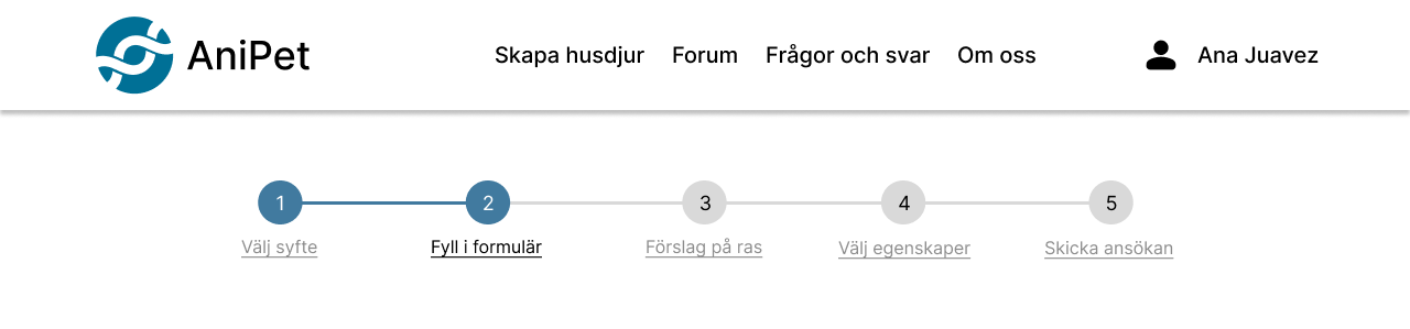
Timeline: 3 Weeks, November 2022. Interaction Design in UX course.
Table of Contents
Summary
This is a case study of a class project we did during the course Interaction design in UX, where we were divided into groups. The assignment was to design an app/service through the non-linear Interaction Design Process.
The assignment was:
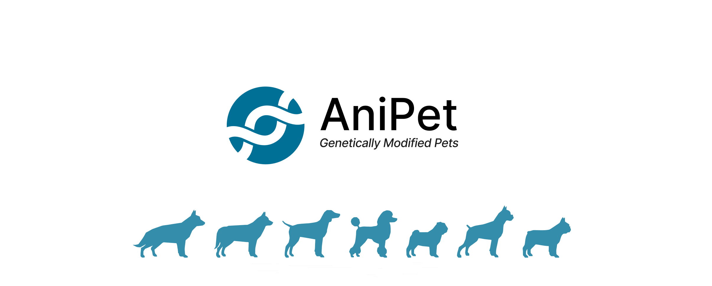
Build-a-pet, Build a business where customers can choose all the features of their ideal pet thanks to genetic engineering.
The Needs and Wants
It was very important to figure out how this “Build-a-pet” idea is going to work in real life scenario, therefore we started by doing an extensive research on genetic engineering of animals and pets. Addressing the ethical, environmental and other problems that comes with it.
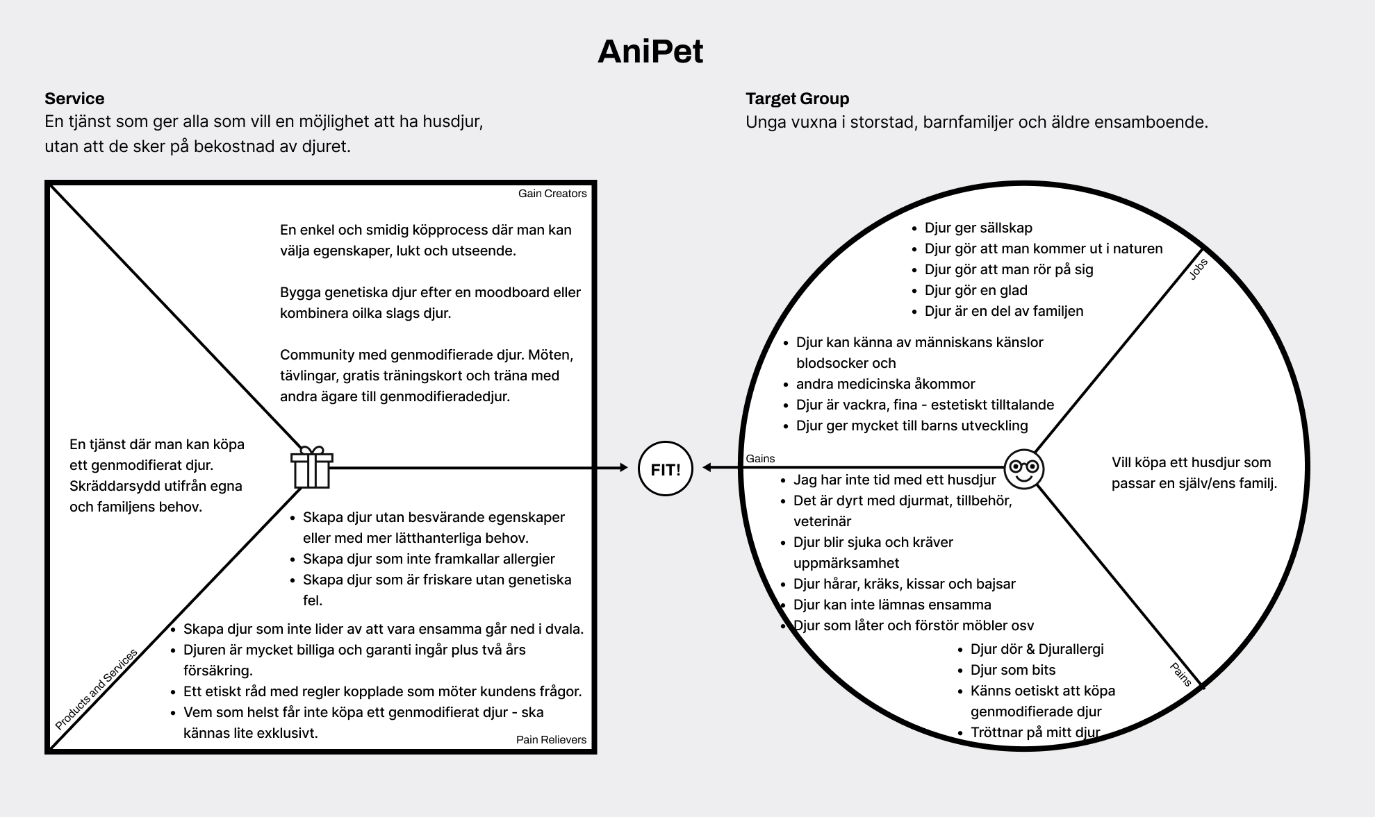
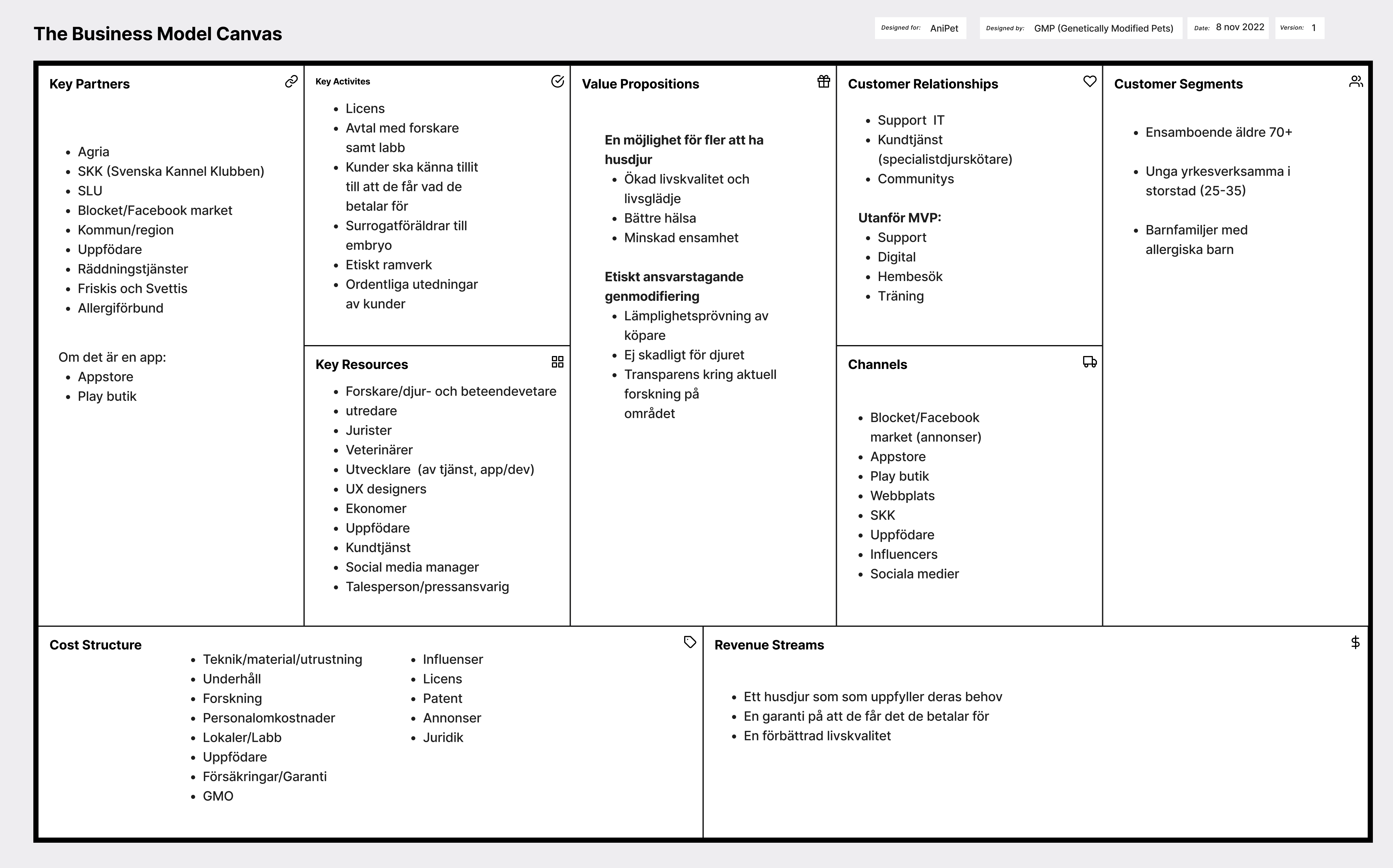
We also made a Value Proposition Canvas and Business Model Canvas, to figure out how the business would work, to identify our means of income, partners, stakeholders, and etc.
Quantitative Research
We started by reading about genetic modification, why you get pets and what influences which animal you buy. Results of our environmental research therefore came to be about animal owners, the science behind genetically modified animals, ethical issues, etc. Below is a summary of our insights and sources in the first part of the research.
We interviewed seven different people, four women and three men, aged 22-82. The purpose was, on the one hand, to create a basis for partly our Value Proposition Canvas, partly our Business Model Canvas. On the other hand, the interviews were also a basis for the three user types/personas we developed.
All interviewees have had pets. Four of them have pets today. Several have opted out of pets. One of the interviewees was a specialist in GMOs.
In the stage of the project we tried to analyze our research data that collected through Interviews, Business intelligence, and competitive analysis. This in turn gave us a very good understanding of what our target wants, their way of thinking, needs, pain points and solutions.
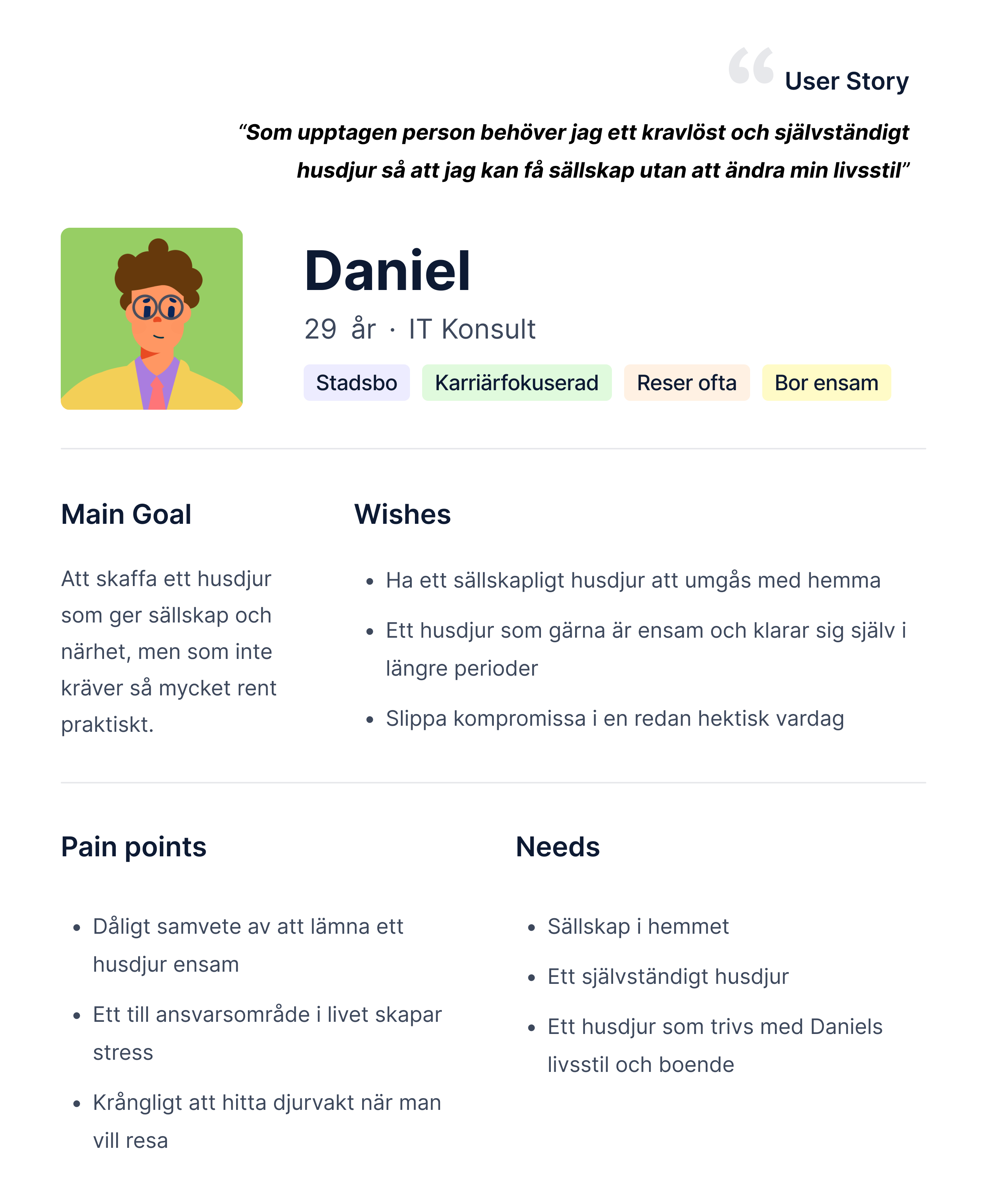
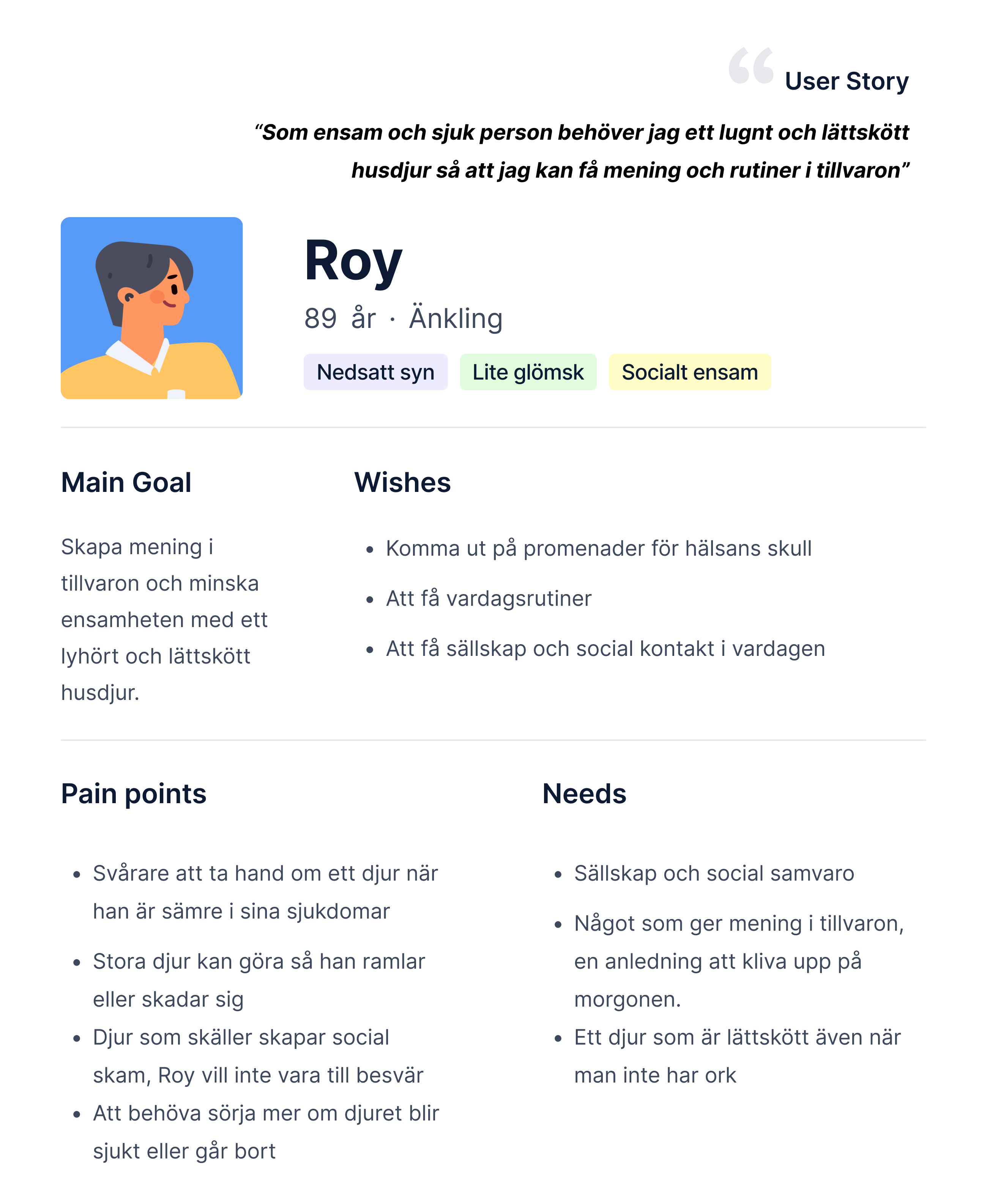
Personas
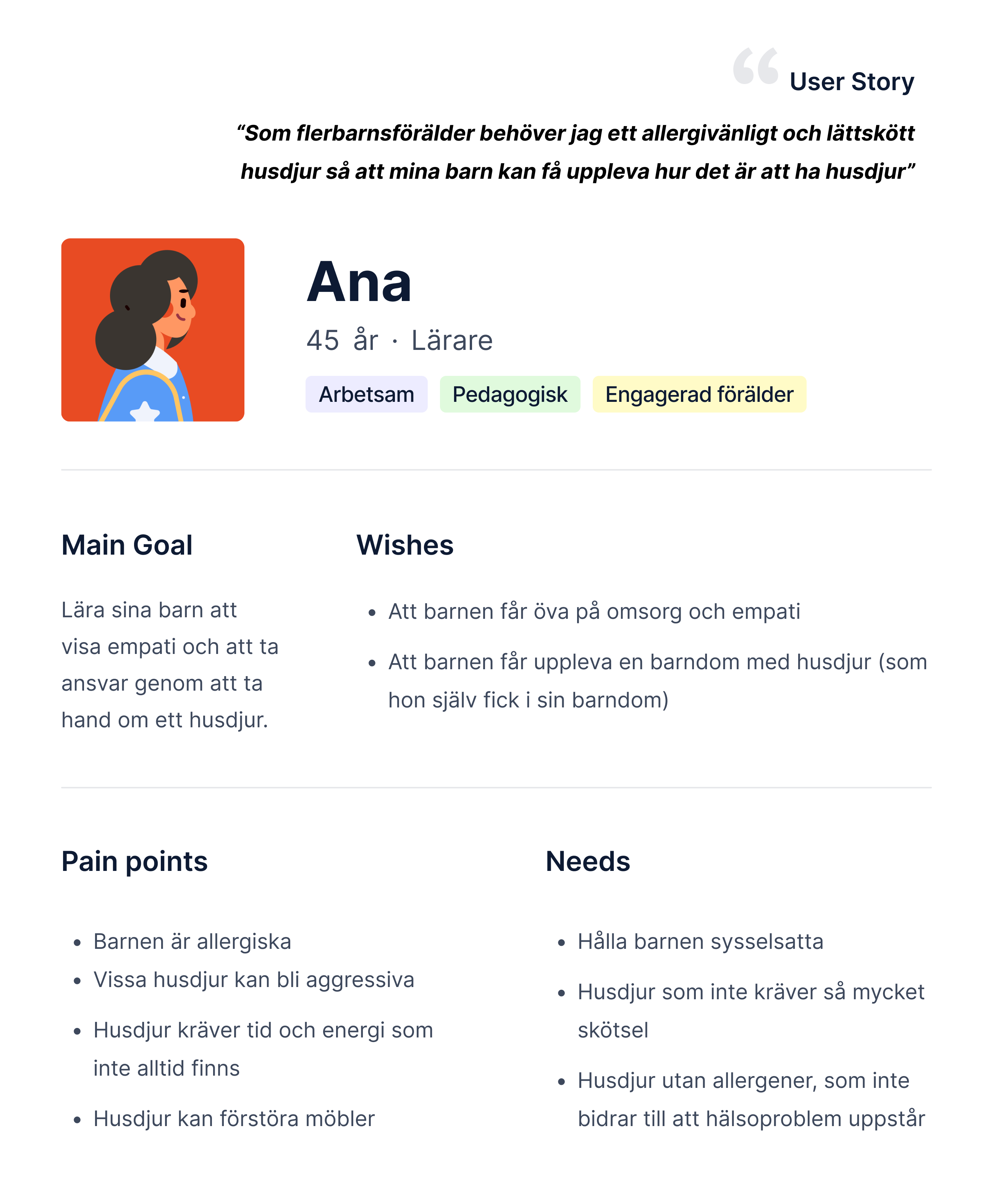
Based on the interviews and environmental research, we created three personas, for whom we then designed the service: Anna, Roy and Daniel. Although after usability testing and creating user journey, we have made some iterations to the personas, especially Ana.
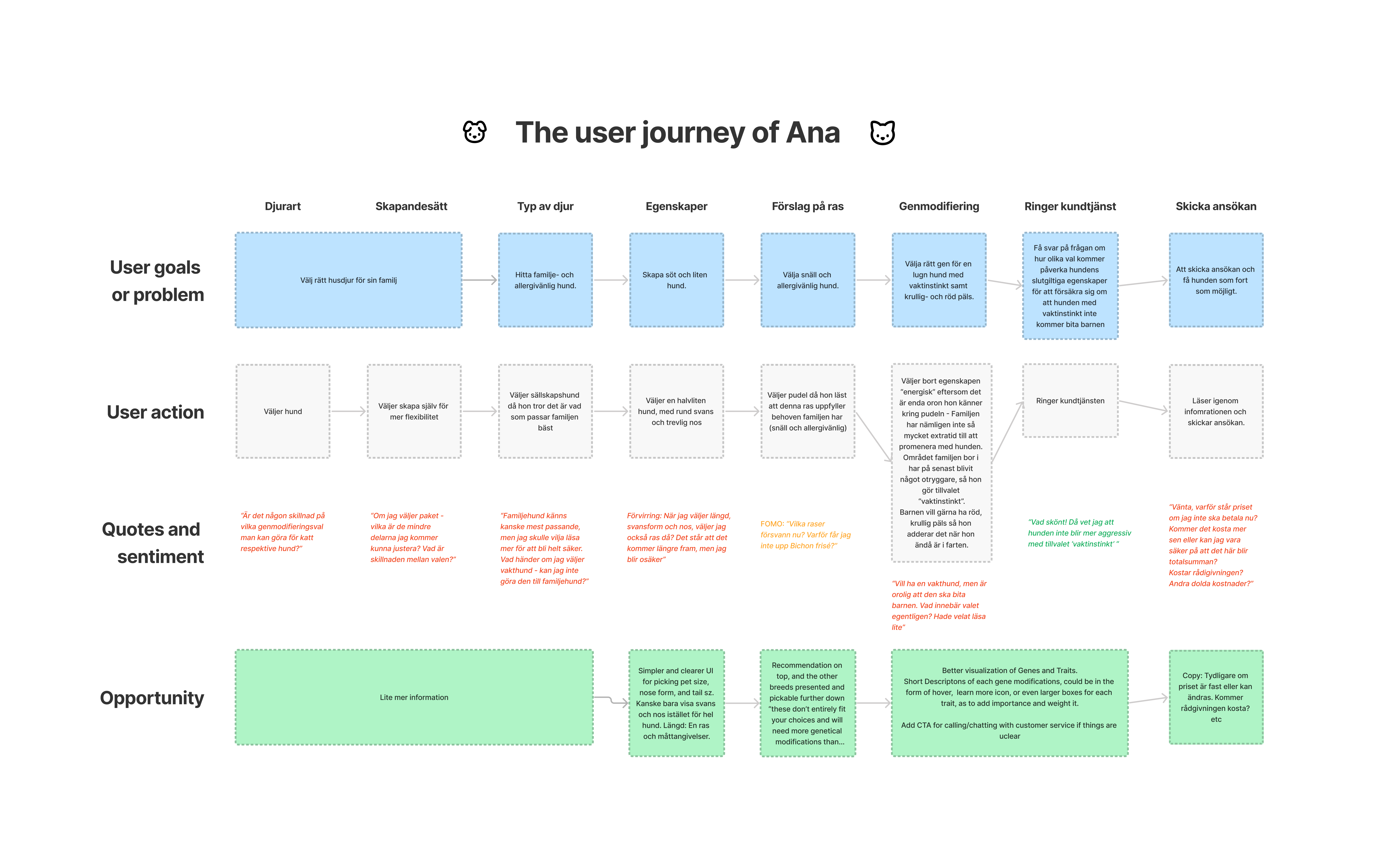
User Journey Map
Of course creating the personas helped us do a proper user journey mapping for our personas, in order to understand them, and figure out their problem areas, questions and solutions.
The Design
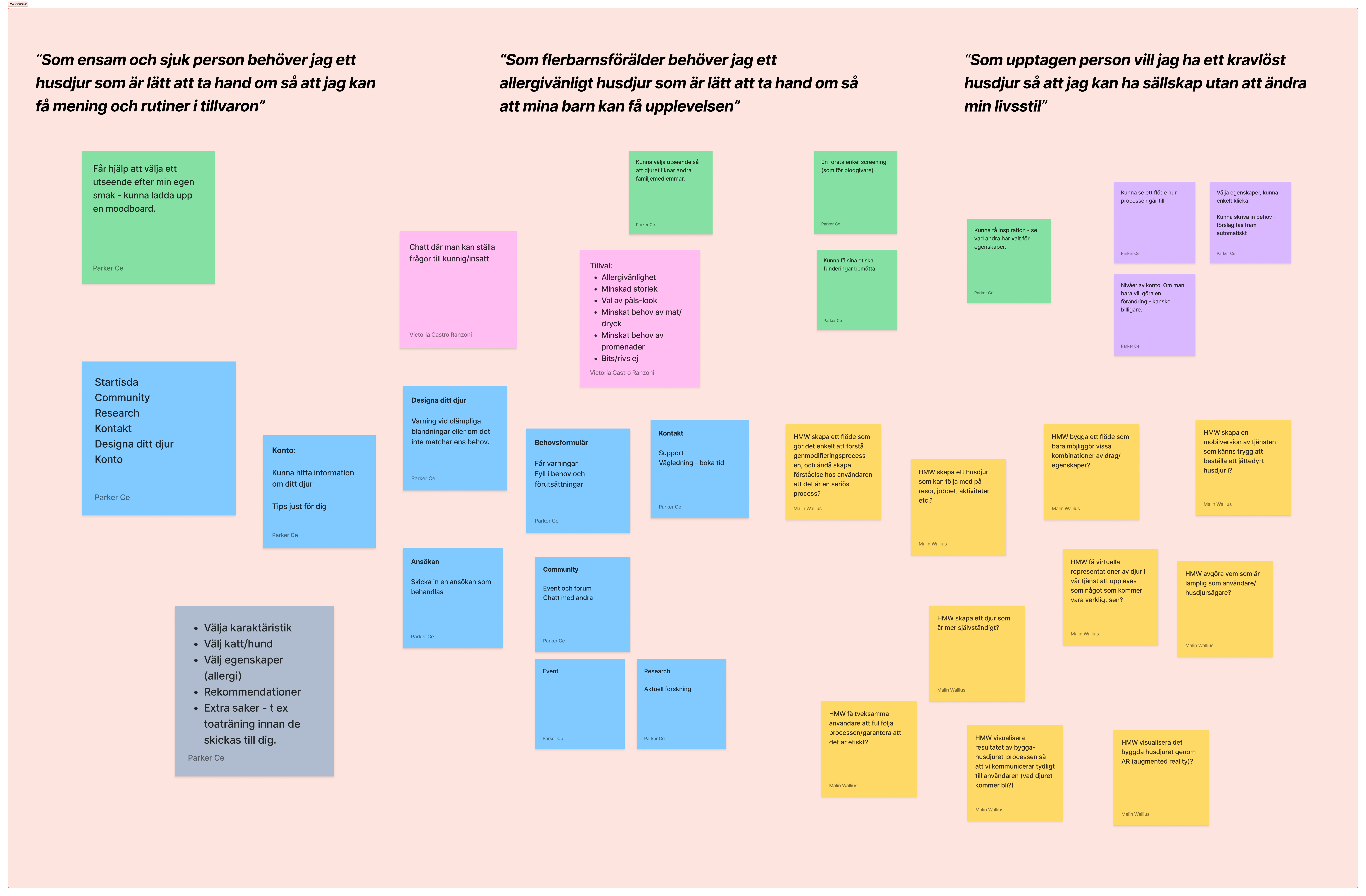
Based on our Value Proposition Canvas, our Business Model Canvas and our insights about the users – which we boiled down to personas – we conducted a workshop based on three different user stories:
As a lonely and sick person, I need a pet that is easy to take care of so that I can get meaning and routines in life.
As a parent of multiple children, I need a hypoallergenic pet that is easy to care for so that my children can have the experience.
As a busy person, I want an undemanding pet so that I can have company without changing my lifestyle.
HMW (How Might We)
We brainstormed a number of features that we thought could meet the needs of users.
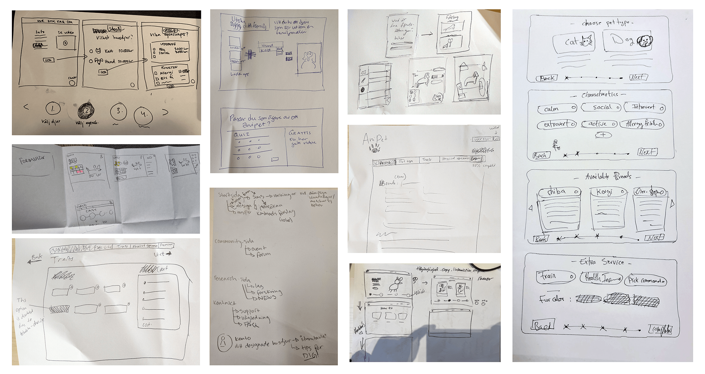
Sketches
We did a small workshop, where we made sketches based on our Ideas that we came up with previously and of course Personas, User stories and their journey maps.
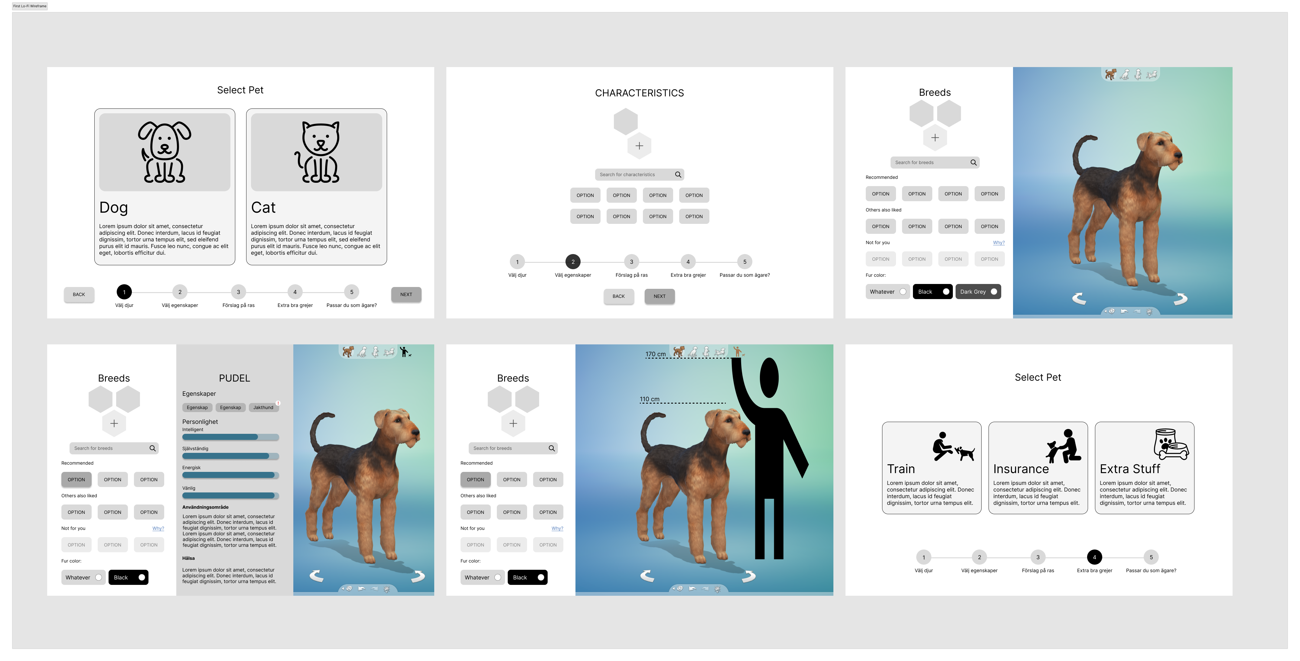
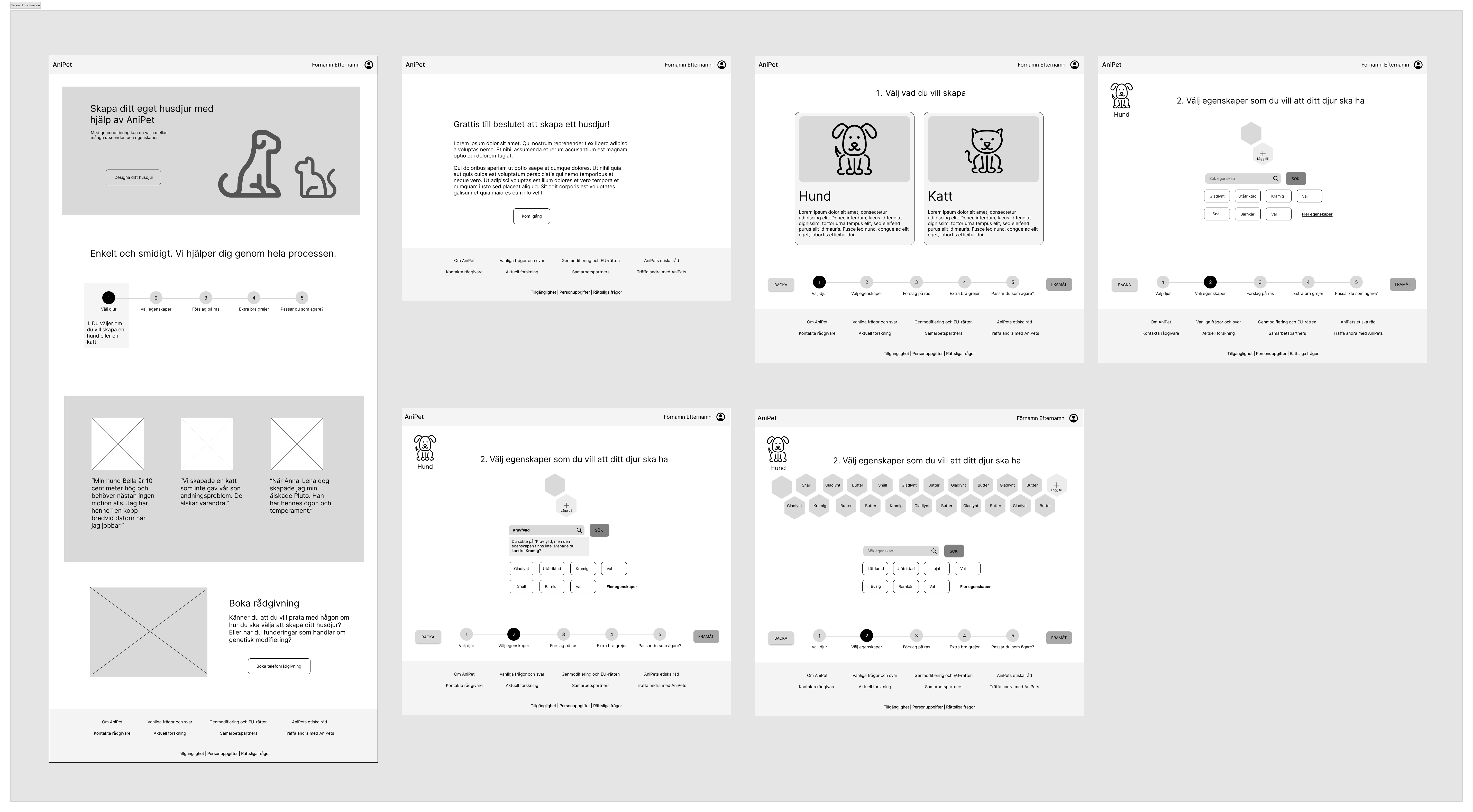
Lo-Fi Wireframes
Combining our sketches and design Ideas, we made a low fidelity wireframe, although some of the pages might look, High fidelity, but those are screenshots from Sims, we used to save time meanwhile deliver the idea.
First Lo-Fi
Second Lo-Fi Iteration
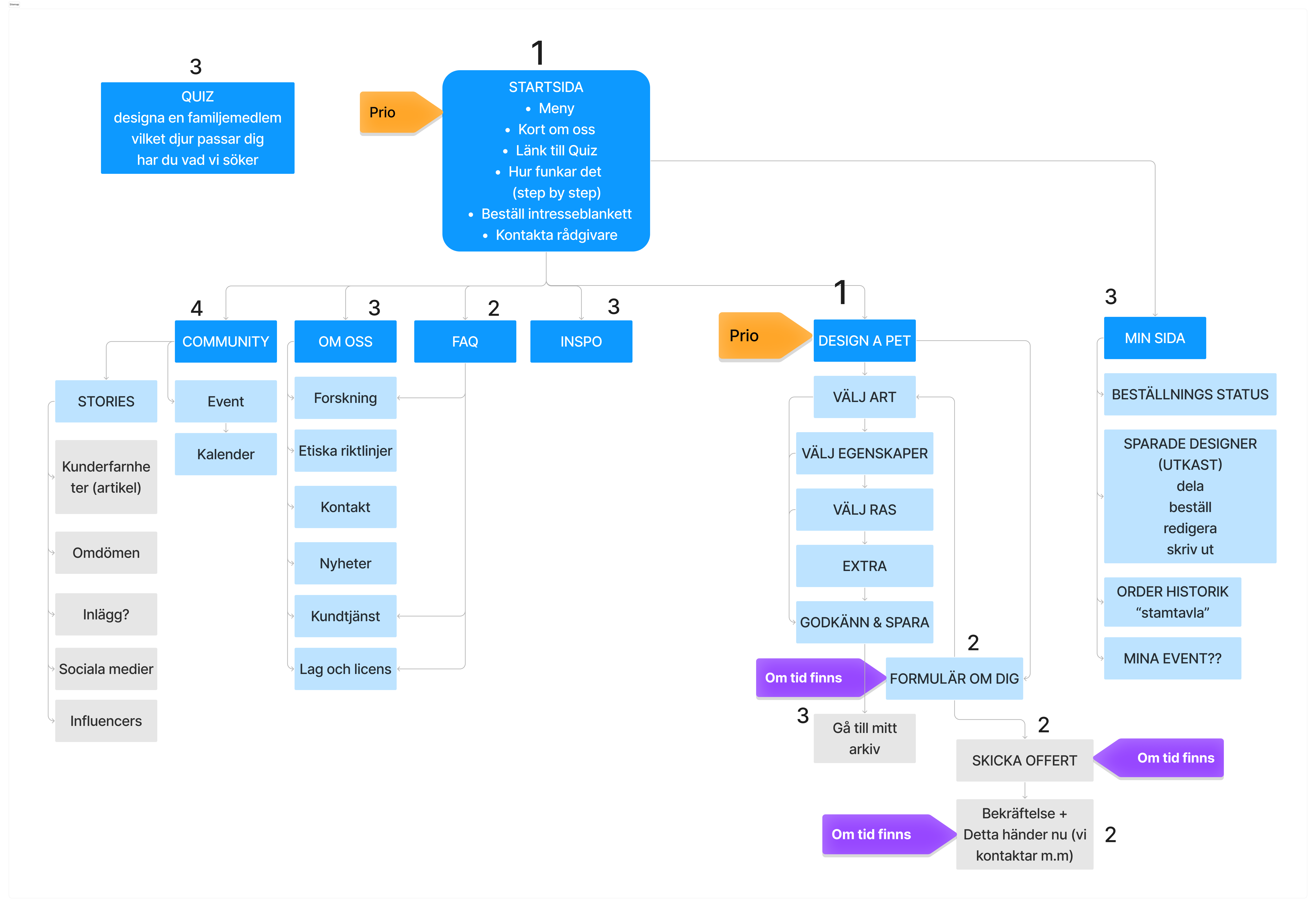
Site map
Based on the feedback we received from the first test in the classroom and after discussions about various functions and solutions, we created a site map.
Although we were a bit ambitious at the start, but had to prioritize the vital parts of the service, which is of course the Interaction Design of Anipet, where the customer gets to pick what to modify in their dream pet.
The Home Page
After a vote in the team, we decided that we should prioritize designing and testing the home page first. The reason was that we wanted to get confirmation that our business model and our offer would really land right. The feedback we received from the class after our first sketches was also about the fact that it was not clear what we actually offered.
We decided to create a landing page that was:
Clear
Instilled trust
Invited the customer to try AniPet
We tested the homepage on five people, and we received a lots of feedback in different aspects of the home page, and here is a list of Interaction Focused feedbacks that we received.
A bit unclear why we have two buttons called the same thing.
Unclear if you need to create an account before pressing Create an animal.
Can be unclear what Creator Tools in the menu is in relation to the button.
Possibly the sections would need to be a little smaller so that you see that you need to scroll down.
However, it seems to be clear what happens if you press the button. They expect to be guided through pages where you fill in various choices, such as size, breed, color, etc.
Fixing the home page while keeping the feedback in mind, we made the final home page design, and tested it with our classmates, and then a final iteration was done. You can see the result on the right side.
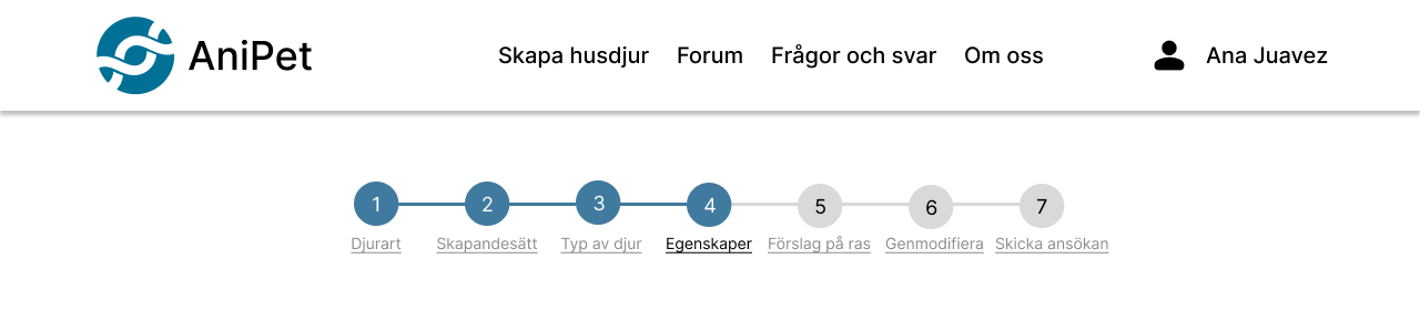
Flow Chart
After the feedback that we received combined with our focus Interaction Design of the product, we had to perfect our Flow chart, and that’s exactly we did.
Prototype
After several iteration of our flow chart, we were happy with result, which included the functions, and interaction that we wanted. Then put all our focus on the making the prototype, as we’ve already had the Lo-Fi wireframes, we started from there.
Prototype Test
As our first clickable prototype was ready for a test, we did a large group test within the classroom, and gave them a scenario to follow through.
You and your family want a dog for a specific purpose: companionship.
Your kids want a poodle with a ball-shaped tail and red curly fur.
You want it to guard the house, but not so energetic.
Then you send in your application.
Test Results
Of course since this was our first clickable prototype, mind you not a fully clickable, but enough for the test. We found out that there were many improvements to be made in the product, in the interactions, UI and visual part of it. The following are some of the major changes we made to the product.
- Progress bar
- Horizontal bar
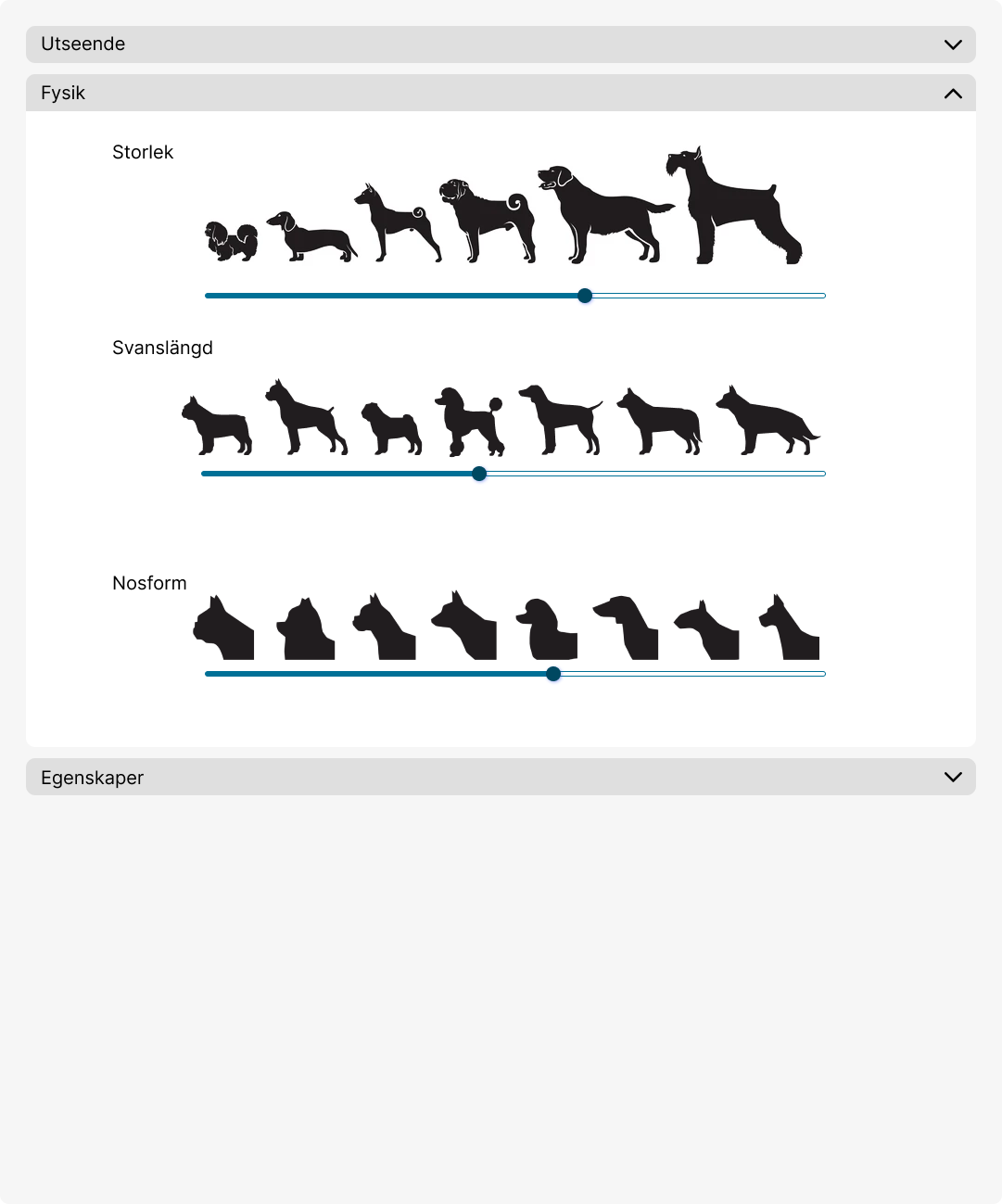
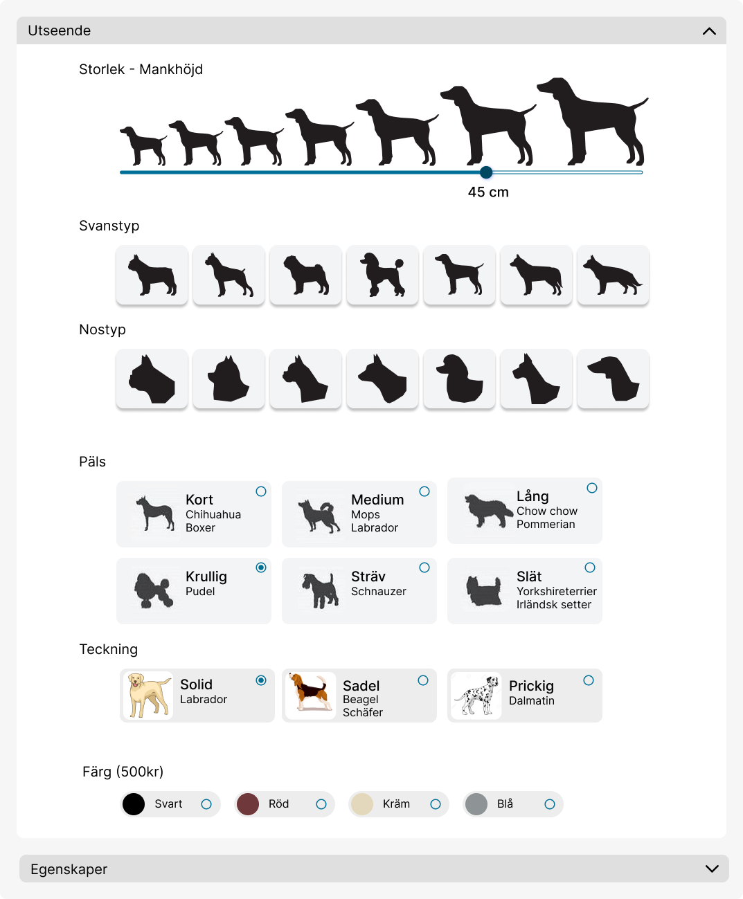
This scrollbar is not very ideal, but we wanted to limit the option of picking a size. We added size indication in CM.
Scrollbar is a bit confusing for picking tail length and snout form. Then we changed it to clickable single button for each tail length and Snout form.
The illustrations we used for the size of the dog, was confusing to some as well. As it showed different sizes in different dog breeds, that made users think and question whether they are picking the size of the dog, and/or dog breed.
We had these three options under the tab “Fysik”, but we also had the option of “Utseende”, but it made more sense to group them together, as to “Not make think!” was our goal.
Final Product
After many iterations and test, we have finally made our final prototype, although it may not be a “perfect” product, but there will always be room to grow and improve.
There will always be room for improvements, there are a few things that I would like to improve upon in the future.
UI and Visual Design: Although we have a good design, but works well with smaller screens at the moment, but I want to design a mobile version of it and more suitable for large number of devices and screen sizes.
Iconography: It’s a bit challenging to use and find proper Icons that represent the functions.
Accessibility: We did have accessible design in mind when started designing the product, for example we paid attention to the contrast, and text seizes, though it can still be more accessible.
Better and more use of white space throughout the product.
Thoughts and Takeaways
We spent a lot more time on the Homepage design than we should’ve, though at the time we thought that it was important to sell the idea of getting your dream pet through genetically modifying pets.
We could’ve benefited in working in small mini teams within the group, on different parts of the design and service throughout out the given time more often.
We took the advantaged of this being a class project, by going out our comfort zone through taking part in different aspects of the project, for example, if one is good at heavy research would team up with another to do UI.
Things rarely go by the book, for example, at the beginning of the project we planned out almost everything, be different parts took longer time than we expected, for example, the research and analysis took longer than we expected.