Accessibility Review of Storstockholms Lokaltrafik (SL.se)
Team: Patryk Chodowiec & Habee Shirzad
My role: Evaluation, Research and Analysis
Design Tools: Figma, Web Disability Simulator, HeadingsMap, Colour Contrast Checker and Silktide – website accessibility simulator.
Timeline: 1 Week, October 2022
A study and evaluation of Accessibility at Storstockholms Lokaltrafik (SL). Currently working with a classmate Patryk, to examine the A11y of SL’s online services, mainly the website.
Accessibility Check List:
- Color Scheme & Contrast
- Iconography
- TAB markings
- Screen reader optimization
- Use of animation and flashing colors
- Clickable areas such as buttons and menu items
Table of Contents
What is A11Y?
When it comes to UX, accessible design is a way of designing so that everyone can use the service or the product, no matter what disabilities or conditions the user has that can make it difficult to use service. These disabilities could be situational, temporary or even permanent.
Accessible design doesn’t only benefit people with disabilities, but everyone who uses the service. Accessibility helps us become inclusive with our design.
Why is it important at SL?
A lot of people use SL everyday and it plays a vital role in everyone’s lives. SL allows people to travel to work, to meet friends & family, and create memories. It is important that everyone can take part, without getting stuck on the website or being excluded by the functionality. SL needs to be inclusive so that everyone can make these trips.
An important way of becoming inclusive is to make, of course, the online or the digital services accessible such as the website, because most of the time, that is where the journey starts.
The Accessible Parts of SL
Let’s start with giving SL a bit of credit in trying to make the website accessible. During our evaluation we found parts of SLs website that are accessible, that make it easier for people to use the website to, for example, search for a journey, read traffic news, read information and buy tickets.
Contrast
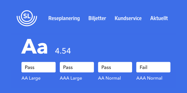
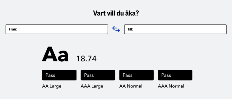
We ran some color contrast tests using accessibility plugins and tools directly on the pages, of course we targeted the main color palette, and travel-search-box first. and for the most part they pass the minimum requirement of color contrast.
Usage of Icons, Texts & Colors
The webpages are mobile responsive, and the majority of the clickable areas are large enough, and easily accessible.
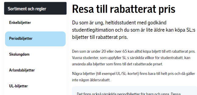
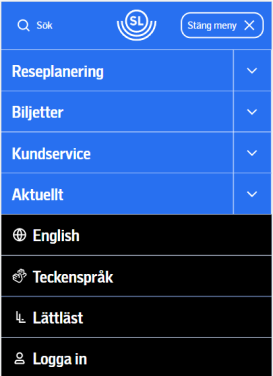
Icons are always accompanied with a text, which makes it easy to understand without needing to guess the meaning behind the icons.
TAB Markings
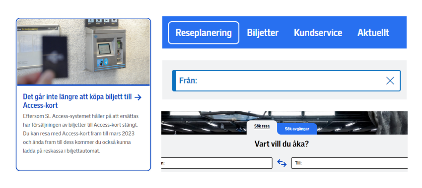
Almost all of the focus markings are clear and visible. It uses a combination of underlined texts, outlines, animations, and color.
Parts that could be More Accessible
Let’s start with giving SL a bit of credit in trying to make the website accessible. During our evaluation we found parts of SLs website that are accessible, that make it easier for people to use the website to, for example, search for a journey, read traffic news, read information and buy tickets.
Better Screen Reader Optimization
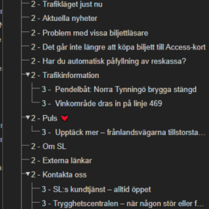
The screen reader marks checked/unchecked radio buttons on “Sök Resa” and “Sök Avgångar”, this can cause confusion and make it difficult to navigate when using a screen reader and searching for a journey.
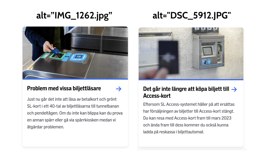
Alt texts have file-names in them which causes the screen reader to read the filename, even though in some instances the image is just decorative. In that case when an image is decorative, we would suggest leaving the alt-text field empty as it doesn’t really contribute to understanding the context.
Better Color Contrast for the Color Blind
Some colors barely pass the minimum recommended contrast, and it gets worse in grayscale, in some cases the color combination doesn’t work on either color or black and white.


TAB flow & Structure
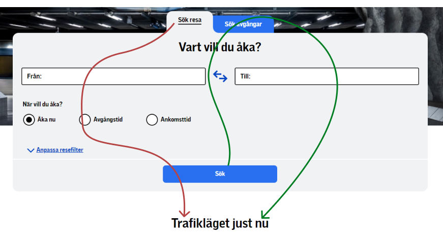
As mentioned previously, the tab flow & structure are good enough, though it could be improved, for example in the search area, the tab starts at “Sök Resa” then ends at the button “Sök”, and then jumps to the next part. This could be improved by going to the next tab “Sök avgånger” then the next section.
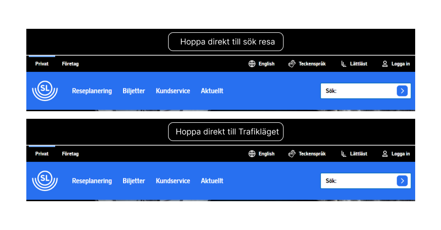
Currently at the top of the page there is only one skip option or Shortcuts if you would, which jumps over the search trips to the announcements. This could also be improved by adding two more options, such as “Hoppa Direkt Till Sök Resa” and “Hoppa Direkt Till Trafikläget”.
Consistency
Another area of the experience that could be improved, is the consistency of the design, for example when hovering it adds a bit of drop shadow and underlines the heading, but when focusing it has all that plus an extra border.

The submenus have the same inconsistency here, focusing works better on color and black and white, but not when hovering.
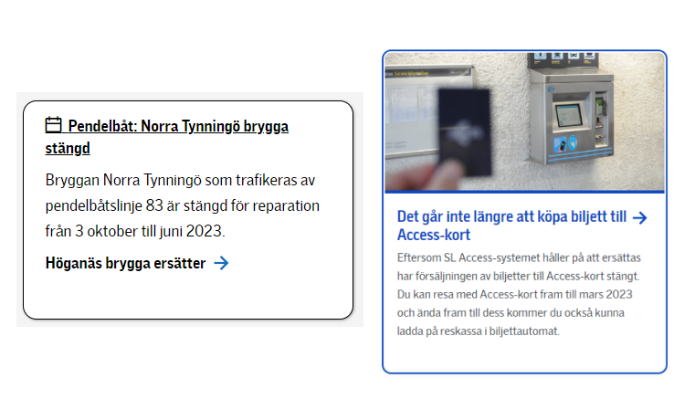
Here we have 2 boxes which have different properties when focusing (tab) on them.
Priorities
Based on our findings of the problem areas, we have come up with a prioritized list, so that the SL design team can work on, according to how important the problem is and how much it will help SL become even more accessible.
Better Screen Reader Optimization
We believe that improving the screen reader optimization is the most important priority. SL clearly has an issue with some areas we mentioned that can make it difficult to use if the user has a screen reader.
Better Color Contrast for the Colorblind
Better contrasts for the colorblind also needs improvement where SL cannot only rely on colors, but needs to do some kind of visualization that works even if the user is colorblind to display what is happening on the screen.
Tabbing Flow & Structure!
Create more shortcuts, in the beginning, to optimize tab-navigation for people who use the keyboard to navigate and offer the users to skip certain areas, especially large sections that require the user to tab through each element to get past that section.
Future of Accessibility at SL
- The future looks bright at SL when it comes to accessibility. SL has stated that certain problem areas are going to be fixed by mid 2023 and that ambition is something we admire.
- It is important to test frequently with many different users.
- Include accessibility as an essential subject during meetings.
- Always start with accessible design, that should be your foundation and then proceed from there and make it beautiful!
